 New topic
 Printable
charlottegelin said: Byron said: The spooky room one, to me, doesn't really fit the music...it feels more like a Led Zeppelin CD cover, a more rock and guitar vibe (at least to me). Love the photo, tho. I thought the same thing..lol | |
- E-mail - orgNote -  Report post to moderator Report post to moderator |
superspaceboy said: Here are a few I did...I'm considering these for the insides

 If those images are going in the inside, then this cover would seem to fit well: 
I'm not crazy about the image as the CD cover lol, but it does fit well. | |
| - E-mail - orgNote - Report post to moderator |
byron is right, the gold is best Power tends to corrupt; absolute power corrupts absolutely. - Lord Acton | |
| - E-mail - orgNote - Report post to moderator |

Bored...so here's another..lol
 | |
| - E-mail - orgNote - Report post to moderator |
charlottegelin said: cborgman said: the one of kennedy with the headphones and the capsule gets my vote... very clever
what about copyright issues for the photo? according to the person who put it together they are royalty free. Christian Zombie Vampires | |
| - E-mail - orgNote - Report post to moderator |

superspaceboy said: ok here are some of the submissions...
This one is the best so far to my eyes. Maybe the colours should be adjusted, but it's alright for a small release. I think the SC logo that you have is better for, say, a promotional (CD-R?) single release or something. But it's alright too. I'd like to see some submissions with less gaudish colours myself. | |
| - E-mail - orgNote - Report post to moderator |
|
I guess everyone is looking for more toned down colors but, I really like this one... I like some of the others. They seem like they are missing something though.
 Shake....shake, shake, shake. |
| - E-mail - orgNote - Report post to moderator |


I'm not going to make any comments yet since I'm participating in the contest, but I am starting to get curious to know what Bob thinks? Are the results going to be posted any time soon? | |
| - E-mail - orgNote - Report post to moderator |
my apologies for not partaking, I've got a lot on my plate right now.
sorry, I would have loved to. | |
| - E-mail - orgNote - Report post to moderator |
LleeLlee said: my apologies for not partaking, I've got a lot on my plate right now.
sorry, I would have loved to. Which is your favourite of the ones posted? Just curious. | |
| - E-mail - orgNote - Report post to moderator |
retina said: LleeLlee said: my apologies for not partaking, I've got a lot on my plate right now.
sorry, I would have loved to. Which is your favourite of the ones posted? Just curious. I like this one: It has an energy and movement that I like. | |
| - E-mail - orgNote - Report post to moderator |
any more opinions? | |
| - E-mail - orgNote - Report post to moderator |

OK here my initial thoughts....

This has been getting a lot of good responses so far. It does convey the right feel to the music. I like this one. 
This one too. But As others have mentioned, it kinda doesn’t go with the feel of the music. 
I like this one a lot. If it were to be used, we may need to change a few things on it. 
Also got a few nods. It’s a bit abstract for me. 
A bit too much. But it got mentioned and someone even tried changing the colors, but it still looked a bit busy. Good design though. 
I Liked this one too.
A few liked this one but wanted to know what the thing floating was? A pot roast? This has mystified my friends. Good work everyone. I still need to talk to my music partner and see which he really likes and/or wants to use. He hasn’t really warmed up to any, yet has no ideas of his own…quite frustrating. I get the feeling that if I wasn’t involved in the process, a decision could be made. So, even though a “winner” will be pick, I do not know the likely hood of it’s inclusion in anything we do. Right now, he’s wanting to test out the album…make another ep… So we finished the album last week. MINOR tweeks and an intro needs to happen, but we're holding off on taking it further and spending money, unless it becomes worthwhile. We'll probably press them ourselves at first. My guess…I’ll want to use one of these (or a derivative of) for the ep we are discussing. I’m also going to try and take my favorites and give them to a graphic designer I know to see what he can come up with…font and design wise. I may be asking for some of these in good quality without fonts from some of you. again…thanks and stay tuned for a winner to be announced. [Edited 3/9/06 13:16pm] [Edited 3/10/06 23:18pm] Christian Zombie Vampires | |
| - E-mail - orgNote - Report post to moderator |
purpleizpassion said: I guess everyone is looking for more toned down colors but, I really like this one... I like some of the others. They seem like they are missing something though.
I like this one. | |
| - E-mail - orgNote - Report post to moderator |
superspaceboy said:
A bit too much. But it got mentioned and someone even tried changing the colors, but it still looked a bit busy. Good design though.  | |
| - E-mail - orgNote - Report post to moderator |
I had a go, the image is royalty free and I liked it a lot and added some tweaks and filters.


... decided to keep the overall look fairly simple. [Edited 3/10/06 6:46am] | |
| - E-mail - orgNote - Report post to moderator |
|
LleeLlee said: I had a go, the image is royalty free and I liked it a lot and added some tweaks and filters.
... decided to keep the overall look fairly simple. [Edited 3/10/06 6:46am] That's cute! Shake....shake, shake, shake. |
| - E-mail - orgNote - Report post to moderator |
one more, I put the mothe inside the capsule cause I like moths hehe!
 | |
| - E-mail - orgNote - Report post to moderator |
Both of LleeLlee's designs are great! (the fonts should be changed a bit but they're fantastic otherwise)
But are they the right size? | |
| - E-mail - orgNote - Report post to moderator |
| |
| - E-mail - orgNote - Report post to moderator |
2the9s said:
it's like staring into the face of pure evil... on a cd cover! Power tends to corrupt; absolute power corrupts absolutely. - Lord Acton | |
| - E-mail - orgNote - Report post to moderator |
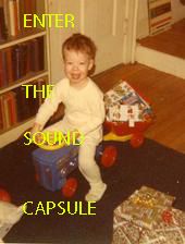
|
this was my submission. | |
| - E-mail - orgNote - Report post to moderator |