 New topic
 Printable
susannah said: Thanks guys
On a related note: I just spent 2 hours running all over town to find somewhere to bind it, when it turns out they DO do it here at uni And don't shout at me, I'm waiting for my friend and I'm going for breakfast, then I will work it is 11am | |
- E-mail - orgNote -  Report post to moderator Report post to moderator |

ellieadore said: susannah said: Thanks guys
On a related note: I just spent 2 hours running all over town to find somewhere to bind it, when it turns out they DO do it here at uni And don't shout at me, I'm waiting for my friend and I'm going for breakfast, then I will work it is 11am I WAS HERE TIL 11PM LAST NIGHT! Rock n roll baby | |
| - E-mail - orgNote - Report post to moderator |

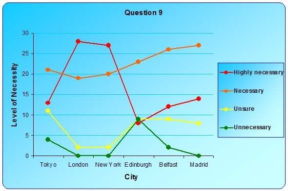
This thread is really... unfortunate. But I say the bar graph! | |
| - E-mail - orgNote - Report post to moderator |
susannah said: ellieadore said: it is 11am I WAS HERE TIL 11PM LAST NIGHT! Not long to go now until we | |
| - E-mail - orgNote - Report post to moderator |
ellieadore said: susannah said: I WAS HERE TIL 11PM LAST NIGHT! Not long to go now until we ok I am going back to work now Rock n roll baby | |
| - E-mail - orgNote - Report post to moderator |
The first graph is clearest to understand. I really like spicy food. I mostly put Jalapenos on a lot of my food.
"There are three types of women for a man. The woman he wants to marry, the woman he should marry, and the woman he ends up marrying". -Pedro Infante- Una Vez Y Otra Mas! | |
| - E-mail - orgNote - Report post to moderator |

Good luck sweety. Yeah, the first graph.
M MyeternalgrattitudetoPhil&Val.Herman said "We want sweaty truckers at the truck stop! We want cigar puffing men that look like they wanna beat the living daylights out of us" Val"sporking is spooning with benefits" | |
| - E-mail - orgNote - Report post to moderator |
It depends what you are trying to conclude.
Each is an independent analysis so by placing them in some kind of order in graph one you are implying importance to each end of the graph. In which case the area graph (graph 2) is the best for the job (despite looking hideous BTW). If your message is as I expect it to be and warranting graph one, then put the cities in alphabetical order. You can then discuss the implications on London and New York as "most necessary" in your discussion. This gives a more non bias approach to presenting the data and at the same time give you scope for discussion (without “giving it all away”) I would also tone down the colours, it is possibly better if you let the data speak for itself and it is good data Please excuse my comments if you like but you knew I wouldn't be able to stay away from this one! Let me know if you have any other Q's There are other options too for the graphs such as individual pie charts for each city but that could look messy. [Edited 5/1/07 8:06am] Happy is he who finds out the causes for things.Virgil (70-19 BC). Virgil was such a lying bastard! | |
| - E-mail - orgNote - Report post to moderator |

PREDOMINANT said: It depends what you are trying to conclude.
Each is an independent analysis so by placing them in some kind of order in graph one you are implying importance to each end of the graph. In which case the area graph (graph 2) is the best for the job (despite looking hideous BTW). If your message is as I expect it to be and warranting graph one, then put the cities in alphabetical order. You can then discuss the implications on London and New York as "most necessary" in your discussion. This gives a more non bias approach to presenting the data and at the same time give you scope for discussion (without “giving it all away”) I would also tone down the colours, it is possibly better if you let the data speak for itself and it is good data Please excuse my comments if you like but you knew I wouldn't be able to stay away from this one! Let me know if you have any other Q's There are other options too for the graphs such as individual pie charts for each city but that could look messy. [Edited 5/1/07 8:06am] I was wondering when you'd show up! I did originally have them in random order, in the order I asked them in the question, but apparently that was difficult to read, and to make my [slightly biased, but then so is the data] point, I put them in order of replies. As for the colours, all my other graphs are simple and look rather snazzy with their blue background and blue data - but there are just not enough shades of blue for this graph! So I went for some sort of "danger" theme I did think of individual pie charts, but there would be too many, and take up too much room, and as it is, the text I have explaining it does a pretty good job, I think... I tried a line graph but that just looked mad. Hang on I will get the other ones on here, just for you Professor Predom Nothing to do with the fact that youre the only person in this thread who's ever marked anything close to a BSc Dissertation! Thanks Steve Rock n roll baby | |
| - E-mail - orgNote - Report post to moderator |
The line graph
The original 2nd graph 
How about this then? Change order?  Rock n roll baby | |
| - E-mail - orgNote - Report post to moderator |
Aaaaand again.
Don't you think the biased one, in order, is clearer than this?  Rock n roll baby | |
| - E-mail - orgNote - Report post to moderator |
susannah said: Aaaaand again.
Don't you think the biased one, in order, is clearer than this? | |
| - E-mail - orgNote - Report post to moderator |

evenstar3 said: susannah said: Aaaaand again.
Don't you think the biased one, in order, is clearer than this? the blue-greens are better though aren't they? Rock n roll baby | |
| - E-mail - orgNote - Report post to moderator |
susannah said: evenstar3 said: the blue-greens are better though aren't they? well, a higher bar in each city translates to more protection needed against terrorism, right? on a basic level i think red = danger, so the other colors might be better. the blues are more matchy though. | |
| - E-mail - orgNote - Report post to moderator |
evenstar3 said: susannah said: the blue-greens are better though aren't they? well, a higher bar in each city translates to more protection needed against terrorism, right? on a basic level i think red = danger, so the other colors might be better. the blues are more matchy though. Thats what I thought! I should have just kept my mouth shut Rock n roll baby | |
| - E-mail - orgNote - Report post to moderator |
susannah said: evenstar3 said: well, a higher bar in each city translates to more protection needed against terrorism, right? on a basic level i think red = danger, so the other colors might be better. the blues are more matchy though. Thats what I thought! I should have just kept my mouth shut Stick the the original red-coloured graph. So clear. Clarity over looks, darling. | |
| - E-mail - orgNote - Report post to moderator |
Spookymuffin said: susannah said: Thats what I thought! I should have just kept my mouth shut Stick the the original red-coloured graph. So clear. Clarity over looks, darling. The first one from the first post? Ok, but I'm waiting for Predom to come back though.... Rock n roll baby | |
| - E-mail - orgNote - Report post to moderator |
susannah said: Spookymuffin said: Stick the the original red-coloured graph. So clear. Clarity over looks, darling. The first one from the first post? Ok, but I'm waiting for Predom to come back though.... I like stars. | |
| - E-mail - orgNote - Report post to moderator |
Spookymuffin said: susannah said: The first one from the first post? Ok, but I'm waiting for Predom to come back though.... I like stars. nvm Rock n roll baby | |
| - E-mail - orgNote - Report post to moderator |
do I get a free 50" plasma TV? http://www.fatpossum.com/...0329-1.mp3
Everybody is a star I can feel it when you shine on me I love you for who you are Not the one you feel you need to be shine, shine ,shine, shine | |
| - E-mail - orgNote - Report post to moderator |
NastyPig said: do I get a free 50" plasma TV?
What d'yo think I am, Comet?! Rock n roll baby | |
| - E-mail - orgNote - Report post to moderator |
Sorry, got caught up in the footie last night and didn't log on again.
Blue green is definitely better. All results, tables and graphs should (in general) stick to the same colour scheme throughout your piece of work. This will give your dissertation clarity and continuity and convey to the reader that you understand the topic and your results. With regard to the order, this is difficult because we are in different fields. In science data should be presented in a random, non-bias fashion. The results you portray are then seen to be more "real" and not messed with. By re-ordering the cities you are almost implying that this was implicit from the start (and therefore why study it?). The order as determined from the results (not by the results) can then be explained in words or, if you like, further figures. There is no justification for the Tokyo first example, like I said yesterday go with alphabetical if you decide to go with and out of order option. As you discuss your data put in another figure just showing the "highly necessary" data in order to illustrate your point. In fact this will highlight the fact that some believed that Edinburgh is in need of protection. Sometimes these smaller points can become lost in a "full" figure. Also by breaking the figure down it will give you much more mileage with your data. One thing I forgot yesterday was to mention that there are no units on your "y" axis, this should be necessity in number of responses (for example, if this is the case) The other graphs are pants! Now can I get on with marking the pile of dissertations I have on my desk? These will fail Happy is he who finds out the causes for things.Virgil (70-19 BC). Virgil was such a lying bastard! | |
| - E-mail - orgNote - Report post to moderator |
PREDOMINANT said: Sorry, got caught up in the footie last night and didn't log on again.
Blue green is definitely better. All results, tables and graphs should (in general) stick to the same colour scheme throughout your piece of work. This will give your dissertation clarity and continuity and convey to the reader that you understand the topic and your results. With regard to the order, this is difficult because we are in different fields. In science data should be presented in a random, non-bias fashion. The results you portray are then seen to be more "real" and not messed with. By re-ordering the cities you are almost implying that this was implicit from the start (and therefore why study it?). The order as determined from the results (not by the results) can then be explained in words or, if you like, further figures. There is no justification for the Tokyo first example, like I said yesterday go with alphabetical if you decide to go with and out of order option. As you discuss your data put in another figure just showing the "highly necessary" data in order to illustrate your point. In fact this will highlight the fact that some believed that Edinburgh is in need of protection. Sometimes these smaller points can become lost in a "full" figure. Also by breaking the figure down it will give you much more mileage with your data. One thing I forgot yesterday was to mention that there are no units on your "y" axis, this should be necessity in number of responses (for example, if this is the case) The other graphs are pants! Now can I get on with marking the pile of dissertations I have on my desk? These will fail THANKYOU Predom Taken it all on board Now, back to work for both of us! Rock n roll baby | |
| - E-mail - orgNote - Report post to moderator |
susannah said: PREDOMINANT said: Sorry, got caught up in the footie last night and didn't log on again.
Blue green is definitely better. All results, tables and graphs should (in general) stick to the same colour scheme throughout your piece of work. This will give your dissertation clarity and continuity and convey to the reader that you understand the topic and your results. With regard to the order, this is difficult because we are in different fields. In science data should be presented in a random, non-bias fashion. The results you portray are then seen to be more "real" and not messed with. By re-ordering the cities you are almost implying that this was implicit from the start (and therefore why study it?). The order as determined from the results (not by the results) can then be explained in words or, if you like, further figures. There is no justification for the Tokyo first example, like I said yesterday go with alphabetical if you decide to go with and out of order option. As you discuss your data put in another figure just showing the "highly necessary" data in order to illustrate your point. In fact this will highlight the fact that some believed that Edinburgh is in need of protection. Sometimes these smaller points can become lost in a "full" figure. Also by breaking the figure down it will give you much more mileage with your data. One thing I forgot yesterday was to mention that there are no units on your "y" axis, this should be necessity in number of responses (for example, if this is the case) The other graphs are pants! Now can I get on with marking the pile of dissertations I have on my desk? These will fail THANKYOU Predom Taken it all on board Now, back to work for both of us! Happy is he who finds out the causes for things.Virgil (70-19 BC). Virgil was such a lying bastard! | |
| - E-mail - orgNote - Report post to moderator |
PREDOMINANT said: susannah said: THANKYOU Predom Taken it all on board Now, back to work for both of us! I'm going for a fry-up now Rock n roll baby | |
| - E-mail - orgNote - Report post to moderator |
susannah said: PREDOMINANT said: I'm going for a fry-up now Y'see now thats where we differ. I have a cold cup of coffee and some bulshit amin to do. I wanna new job Happy is he who finds out the causes for things.Virgil (70-19 BC). Virgil was such a lying bastard! | |
| - E-mail - orgNote - Report post to moderator |
PREDOMINANT said: susannah said: I'm going for a fry-up now Y'see now thats where we differ. I have a cold cup of coffee and some bulshit amin to do. I wanna new job Rock n roll baby | |
| - E-mail - orgNote - Report post to moderator |
susannah said: PREDOMINANT said: Y'see now thats where we differ. I have a cold cup of coffee and some bulshit amin to do. I wanna new job What i would give to be a student again! Happy is he who finds out the causes for things.Virgil (70-19 BC). Virgil was such a lying bastard! | |
| - E-mail - orgNote - Report post to moderator |
PREDOMINANT said: susannah said: What i would give to be a student again! Rock n roll baby | |
| - E-mail - orgNote - Report post to moderator |