 New topic
 Printable
It's got bad fantasy art style. My art book: http://www.lulu.com/spotl...ecomicskid
VIDEO WORK: http://sharadkantpatel.com MUSIC: https://soundcloud.com/ufoclub1977 | |
- E-mail - orgNote -  Report post to moderator Report post to moderator |

Jakeasaurus said: I think it's an awesome cover
Co-sign. | |
| - E-mail - orgNote - Report post to moderator |
By the color and contrast comment, I meant the red, black and orange. Bold colors that draw your attention to the image. I didn't mean the colors with the earth cutout at the bottom. The planet just makes it look like a cheap photoshop effect.
This sybolism with him towering over the Earth makes no sense. I actually like the promo of the symbol with the Earth as the backdrop as someone posted earlier from The Quake. To me this could be the cover design. It's simple, his symbol is highly recognizable as "Prince" and it would undeniably mean a new Prince record to those who see it on the shelves. I guess I just think it's a little tacky when his covers always seem to show a highly brushed image of himself. I just don't get calling an album "Planet Earth." Hopefully this will take on a new meaning when I hear the album. But the cover should've been designed better than it is. I know at least 5 people who could make this in a matter of minutes. Pay someone with skills to do this work. Hell, make Sony do this part. With all this being said, I am greatly looking forward to this disc. The cover will not detract from a quality product. My whole point to this thread is to say he still needs to put more effort into his cover designs in order to bring the full project to life. Especially in the digital age we are now in. | |
| - E-mail - orgNote - Report post to moderator |
Anxiety said: superspaceboy said: I think the 3121 is the new NPG and we'll be seeing that imagry for a while. He seems very connected to it. oh, i know. i just continue to be in denial of the fact. it's the first time he's created a brand name that doesn't have a decent philosophy behind it. 'paisley park', i got. 'new power generation/NPG', i got. '3121' just seems arbitrary by comparison - i know, i've heard all the numerology junk. still and all... IMO, I think the significance is a personal one to him. WHeather or not it wall be divulged what it means remains to be seen. Christian Zombie Vampires | |
| - E-mail - orgNote - Report post to moderator |

Funny, I like the cover. | |
| - E-mail - orgNote - Report post to moderator |

ideation99 said: By the color and contrast comment, I meant the red, black and orange. Bold colors that draw your attention to the image. I didn't mean the colors with the earth cutout at the bottom. The planet just makes it look like a cheap photoshop effect.
This sybolism with him towering over the Earth makes no sense. I actually like the promo of the symbol with the Earth as the backdrop as someone posted earlier from The Quake. To me this could be the cover design. It's simple, his symbol is highly recognizable as "Prince" and it would undeniably mean a new Prince record to those who see it on the shelves. I guess I just think it's a little tacky when his covers always seem to show a highly brushed image of himself. I just don't get calling an album "Planet Earth." Hopefully this will take on a new meaning when I hear the album. But the cover should've been designed better than it is. I know at least 5 people who could make this in a matter of minutes. Pay someone with skills to do this work. Hell, make Sony do this part. With all this being said, I am greatly looking forward to this disc. The cover will not detract from a quality product. My whole point to this thread is to say he still needs to put more effort into his cover designs in order to bring the full project to life. Especially in the digital age we are now in. I totally get the concept. He's touring...apparently it'll be globally. And it looks like this is trying to be a reflection on what his take is with things in the world. I think it'll be a looser concept than this, as Guitar isn't about anything worldy. I look at the caver and it seems he is beholding our planet, sort of god-like...or perhaps is stepping back and taking a look at it in that sense. Christian Zombie Vampires | |
| - E-mail - orgNote - Report post to moderator |
superspaceboy said: Anxiety said: oh, i know. i just continue to be in denial of the fact. it's the first time he's created a brand name that doesn't have a decent philosophy behind it. 'paisley park', i got. 'new power generation/NPG', i got. '3121' just seems arbitrary by comparison - i know, i've heard all the numerology junk. still and all... IMO, I think the significance is a personal one to him. WHeather or not it wall be divulged what it means remains to be seen. well i think that's a lotta crap! | |
| - E-mail - orgNote - Report post to moderator |
Anxiety said: superspaceboy said: IMO, I think the significance is a personal one to him. WHeather or not it wall be divulged what it means remains to be seen. well i think that's a lotta crap! See my sig! Christian Zombie Vampires | |
| - E-mail - orgNote - Report post to moderator |
We should be used to crap covers by now.
Its a good thing that Warner controlled the Batman cover. Batman would have taken off hie gauntlets and held his hands/fingers ever-so-gently over his utility belt. His obsession with his digits is interesting. (Insert something clever here) | |
| - E-mail - orgNote - Report post to moderator |

ideation99 said: By the color and contrast comment, I meant the red, black and orange. Bold colors that draw your attention to the image. I didn't mean the colors with the earth cutout at the bottom. The planet just makes it look like a cheap photoshop effect.
i.c, and agree.
This sybolism with him towering over the Earth makes no sense. I actually like the promo of the symbol with the Earth as the backdrop as someone posted earlier from The Quake. To me this could be the cover design. It's simple, his symbol is highly recognizable as "Prince" and it would undeniably mean a new Prince record to those who see it on the shelves. I guess I just think it's a little tacky when his covers always seem to show a highly brushed image of himself. I just don't get calling an album "Planet Earth." Hopefully this will take on a new meaning when I hear the album. But the cover should've been designed better than it is. I know at least 5 people who could make this in a matter of minutes. Pay someone with skills to do this work. Hell, make Sony do this part. With all this being said, I am greatly looking forward to this disc. The cover will not detract from a quality product. My whole point to this thread is to say he still needs to put more effort into his cover designs in order to bring the full project to life. Especially in the digital age we are now in. I like the red and black also. The orange takes that in a nice direction. The Earth cancels that out. Since the CD is already called Planet Earth, then the actual picture of it doesn't have to be so literal...it could have been a shiny sphere of any color. Black, would have been interesting and would have opened up all other kinds of controversy... Either way, I just want to push the earth an inch to the left or right(while keeping it in orbit), It bothers me every time I see it right in the center. It would also carry Prince's line down but more importantly, it would tell a slightly different story. Why do you like playing around with my narrow scope of reality? - Stupify | |
| - E-mail - orgNote - Report post to moderator |

Literal photograph-real imagery with glows and lens flares is a bit like velvet club shirts... My art book: http://www.lulu.com/spotl...ecomicskid
VIDEO WORK: http://sharadkantpatel.com MUSIC: https://soundcloud.com/ufoclub1977 | |
| - E-mail - orgNote - Report post to moderator |
God, can´t Prince just hire a good designer for a change?
It´s been years since he had a good album cover, TRC aside... | |
| - E-mail - orgNote - Report post to moderator |

ideation99 said: Be prepared for the onslought when this cover gets into rotation. Here's a link to a story I found yesterday on the Idolator website:
http://idolator.com/tunes...268166.php They call it the "ugliest album cover" of the year so far. I agree this isn't the cover I would pick if given a choice, but maybe it will have some sort of lenticular motion (as was suggested a while ago). This may help with the cartoonish design of the photo. As for covers, it's still not his worst. His "worst of" covers? New Power Soul Musicology Lovesexy (yes, I said it) Rave Unto the Joy Fantastic Emancipation The Vault Gold Crystal Ball & now, Planet Earth Come to think of it, pretty much everything since Come sucks IMO. I did like Rainbow Children and 3121 for cover art. But the rest blows. Get a new design artist already! In this new age of digital music, the covers don't really matter anymore. I hope the music is better than the cover. [url] WOW, i'd have to totally disagree because I like some of those covers you have in that list but as for this one i'd agree I guess not that its but but boring. We've seen it for awhile now and I was hoping we'd get something different. Seems very bland. [Edited 6/13/07 13:05pm] "Why'd I waste my kisses on you baby?" R.I.P. Prince You've finally found your way back home. Well Done. | |
| - E-mail - orgNote - Report post to moderator |

Love2tha9s said: ideation99 said: Be prepared for the onslought when this cover gets into rotation. Here's a link to a story I found yesterday on the Idolator website:
http://idolator.com/tunes...268166.php They call it the "ugliest album cover" of the year so far. I agree this isn't the cover I would pick if given a choice, but maybe it will have some sort of lenticular motion (as was suggested a while ago). This may help with the cartoonish design of the photo. As for covers, it's still not his worst. His "worst of" covers? New Power Soul Musicology Lovesexy (yes, I said it) Rave Unto the Joy Fantastic Emancipation The Vault Gold Crystal Ball & now, Planet Earth Come to think of it, pretty much everything since Come sucks IMO. I did like Rainbow Children and 3121 for cover art. But the rest blows. Get a new design artist already! In this new age of digital music, the covers don't really matter anymore. I hope the music is better than the cover. [url] WOW, i'd have to totally disagree because I like some of those covers you have in that list. mmm, the lovesexy cover can´t compare to all the others mentioned. It´s a truly iconic and fantastic cover...those were the days...sigh... [Edited 6/13/07 13:07pm] | |
| - E-mail - orgNote - Report post to moderator |
viewaskew said: The cover is crap, but he hasn't had a nice looking one in years...
This barely merits a cardboard single sleeve. co sign | |
| - E-mail - orgNote - Report post to moderator |

the more i look at it the more horrible it becomes, lol.
i guess i should love it for that alone although i thought that 3121 was a huge improvement on Musicology. it was clean, simple and effective plus it had a great color contrast scheme. the inside booklet though, was another "i'm the prince of disneyland" affair much like emancipation. still it was better than that horrible musicology art, remember when everyone was all like "hell no that is NOT the cover art for the new album! is it?" and yet, it was as someone mentioned i also don't get the idea behind calling an album "planet earth" lol. i guess he didn't want to go naming it after the track "revelation" and give all the orgers the satisfaction, after all these years of saying "i predicted it!!!" having said that, i guess "planet earth" is a lot more cool than naming it "future baby mama" and true love lives on lollipops and crisps | |
| - E-mail - orgNote - Report post to moderator |

Jakeasaurus said: How can you argue with this?
 It would not be "the org" without bitchers and complainers, now would it?!?!?! The cover is fine with me | |
| - E-mail - orgNote - Report post to moderator |

superspaceboy said: Anxiety said: well i think that's a lotta crap! See my sig! your sig would make a better brand name than 3121! | |
| - E-mail - orgNote - Report post to moderator |
i love the cover Yeah it's like "oh you mocked me for liking him but now he's dead it's cool to play him again?" And then they look at you funny when you don't play him. -Timmy on after 6-25 fans | |
| - E-mail - orgNote - Report post to moderator |

Aw man, yo is my main apple scrapple | |
| - E-mail - orgNote - Report post to moderator |
So Prince just called me up to say:
"Anon, you know I was lookin' at this here planet and I got to thinkin' that it's not really working too good with my complexion...I think it's competing with me and it's not letting me POP! the way that I should" And I said "so what do you want to do about this Prince"? He went on about how he was frustrated because he didn't want to be misunderstood...that he wanted to portray a perfect world...a world the way he envisions it... He said (almost tearfully): Anon I want the world to see what I see when I look at Planet Earth. So I took notes and we hung up and stuff, and I pretty much made the changes based on his description and I e-mailed it to him. He just called me back to say: "That's what I'm talkin' 'bout gurl" 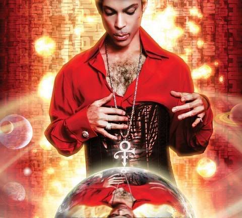 Why do you like playing around with my narrow scope of reality? - Stupify | |
| - E-mail - orgNote - Report post to moderator |
anon said: So Prince just called me up to say:
"Anon, you know I was lookin' at this here planet and I got to thinkin' that it's not really working too good with my complexion...I think it's competing with me and it's not letting me POP! the way that I should" And I said "so what do you want to do about this Prince"? He went on about how he was frustrated because he didn't want to be misunderstood...that he wanted to portray a perfect world...a world the way he envisions it... He said (almost tearfully): Anon I want the world to see what I see when I look at Planet Earth. So I took notes and we hung up and stuff, and I pretty much made the changes based on his description and I e-mailed it to him. He just called me back to say: "That's what I'm talkin' 'bout gurl" this damn site is BEGGING for a 'planet earth' photoshop thread. | |
| - E-mail - orgNote - Report post to moderator |
anon said: So Prince just called me up to say:
"Anon, you know I was lookin' at this here planet and I got to thinkin' that it's not really working too good with my complexion...I think it's competing with me and it's not letting me POP! the way that I should" And I said "so what do you want to do about this Prince"? He went on about how he was frustrated because he didn't want to be misunderstood...that he wanted to portray a perfect world...a world the way he envisions it... He said (almost tearfully): Anon I want the world to see what I see when I look at Planet Earth. So I took notes and we hung up and stuff, and I pretty much made the changes based on his description and I e-mailed it to him. He just called me back to say: "That's what I'm talkin' 'bout gurl" this one is better | |
| - E-mail - orgNote - Report post to moderator |

anon said: So Prince just called me up to say:
"Anon, you know I was lookin' at this here planet and I got to thinkin' that it's not really working too good with my complexion...I think it's competing with me and it's not letting me POP! the way that I should" And I said "so what do you want to do about this Prince"? He went on about how he was frustrated because he didn't want to be misunderstood...that he wanted to portray a perfect world...a world the way he envisions it... He said (almost tearfully): Anon I want the world to see what I see when I look at Planet Earth. So I took notes and we hung up and stuff, and I pretty much made the changes based on his description and I e-mailed it to him. He just called me back to say: "That's what I'm talkin' 'bout gurl" I like it better...though I like the original one too. Christian Zombie Vampires | |
| - E-mail - orgNote - Report post to moderator |
Horrible Cover. In fact, he had worse covers in the past (new power soul, e.g.), but it is one of the worst.
3121 was much better, it had something mystical. This one here is a bad. Come on i don't wanna see the body hair of a 50 years old man. That's ridiculous. | |
| - E-mail - orgNote - Report post to moderator |
| - E-mail - orgNote - Report post to moderator |
tainacher said: Horrible Cover. In fact, he had worse covers in the past (new power soul, e.g.), but it is one of the worst.
3121 was much better, it had something mystical. This one here is a bad. Come on i don't wanna see the body hair of a 50 years old man. That's ridiculous. Love the cover...btw | |
| - E-mail - orgNote - Report post to moderator |
tainacher said: Horrible Cover. In fact, he had worse covers in the past (new power soul, e.g.), but it is one of the worst.
3121 was much better, it had something mystical. This one here is a bad. Come on i don't wanna see the body hair of a 50 years old man. That's ridiculous. lol glad i aint da only one to notice all dat taco meat life is but a dream... | |
| - E-mail - orgNote - Report post to moderator |

I actually like this cover. It sort of reminds me of One Song with the lyrics "I am the Universe..." Seems to have a very spiritual (not religious) connotation to me. | |
| - E-mail - orgNote - Report post to moderator |
i don't really think it's bad since it catches the eye (i guess it's doing it's job). and considering it's supposed to draw your attention to a serious issue concerning our planet, i think it should be loud and bold.
....that plus it totally reminds me of every sticker book i had growing up (minus prince in a corset [Edited 6/13/07 18:53pm] | |
| - E-mail - orgNote - Report post to moderator |