 New topic
 Printable
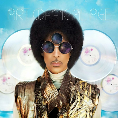
I dig it. Its really grown on me and agree it looks artificial on purpose as a play on the overall concept and message of the album!
Plus...anything is better then this!!!! Now that...that is awful!
The greatest live performer of our times was is and always will be Prince.
Remember there is only one destination and that place is U All of it. Everything. Is U. | |
- E-mail - orgNote -  Report post to moderator Report post to moderator |


I correct myself it's not a gold raincoat looks like a vest but still reminds me of his early days with his raincoat also........ I DO Like this artwork lots of "Contast" with some "Mystery" added in, but not "Too Busy" also "Thought Provoking"
that's not even including the title (that's another ballgame) I'm really getting excited about owning this on vinyl and exploring all the artwork and words written on it (inside and outside) hopefully a lyric sheet inside kind of like the old days that would be Way Cool!
| |
| - E-mail - orgNote - Report post to moderator |

It's cheap and tacky looking but it's par for the course at this point, you can't say you didn't expect this sort of thing. | |
| - E-mail - orgNote - Report post to moderator |

Same pose as "Controversy" | |
| - E-mail - orgNote - Report post to moderator |
| |
| - E-mail - orgNote - Report post to moderator |

| |
| - E-mail - orgNote - Report post to moderator |
Good call that. Musicology cover is dreadful. | |
| - E-mail - orgNote - Report post to moderator |
I like it, the font is cool, Prince is appropriately quirky, he looks like a robotic version of himself. He always had a loud sense of style, flashy and over the top. The platinum PR discs behind him signify whatever you want them to mean: PR being in his past (behind him); he's the genius behind PR and look at those shiny discs behind me; soon, four whole cd worth of PR material will be available to you -- but first you have to listen to my new stuff; my spiritual eye needs its own shade because the world is on fire with sin; if Lady Gaga would dress up as Prince for a Prince influenced record, this is exactly what it would look like.
| |
| - E-mail - orgNote - Report post to moderator |

It shouldn't matter but it does - it's shit!! ... Where's Jeff Katz & Laura LiPuma when you need them. | |
| - E-mail - orgNote - Report post to moderator |
I like it......he can't please everyone. Love God and I shall 4ever Love u | |
| - E-mail - orgNote - Report post to moderator |

|
Even if the concept was to make him look "artifical" as some have speculated here, meh. The "cloud" concept seems to make more sense to me (the afro and the albums), but...
All that Photoshop work and his glasses are still crooked. They're higher on the left than the right. Check out The Mountains and the Sea, a Prince podcast by yours truly and my wife. More info at https://www.facebook.com/TMATSPodcast/ |
| - E-mail - orgNote - Report post to moderator |


It's striking at least.
Musicology was pretty bad. Rave too. and 20ten. | |
| - E-mail - orgNote - Report post to moderator |

|
Is it worthy of being in a museum? Ehhh.. Is it the worst ever? Definitely not. Are some just hungry for SOMEthing to dig into critically? Oh, most definitely. Let it go, people... It's not that bad of a cover. Just accept and enjoy! |
| - E-mail - orgNote - Report post to moderator |

This cover blows chunks. But it's not as bad as NPS. That's do terrible it's practically good. It's not an album, but the cover of a Rave Un2 the Year 2000 is the WORST cover of anything Prince has produced. It's just astounding. "Drop that stereo before I blow your Goddamn nuts off, asshole!"
-Eugene Tackleberry | |
| - E-mail - orgNote - Report post to moderator |

I like it. [Edited 8/27/14 23:28pm] | |
| - E-mail - orgNote - Report post to moderator |
| |
| - E-mail - orgNote - Report post to moderator |
For the worst photoshop hatchet job you need to look at Plectrum Electrum, jaggy cut n pastes, white halos etc. looks like a 5 min job done on that one ..sharmone MF..! | |
| - E-mail - orgNote - Report post to moderator |

It's interesting that's for sure | |
| - E-mail - orgNote - Report post to moderator |
I dont care for the cover. But i will say the title is absolutely fitting I will take my place, In the great below | |
| - E-mail - orgNote - Report post to moderator |

I like it - the image, the font, the play on words, the radiant white & blue colouring motif, his jacket - he's done a lot worse.
| |
| - E-mail - orgNote - Report post to moderator |

|
I reminds me of the recent Janelle Monae Archandroid cover art and the Christina Aguilera Bionic cover art from several years back. Not so much in exact content, but in style (photo with superimposed stuff over/behind). . A clever cover art treatment would've been to go against the Art Official Age title, and have him in his bedroom clothes from Purple Rain (undershirt, jeans, barefoot, hair stylishly messed up) maybe sitting on a floor playing a guitar. |
| - E-mail - orgNote - Report post to moderator |

|
First, I wrote "invoke" the cloud icon - not copy it exactly. Obviously they're all different - Adobe Creative Cloud uses only 2 bumps and not 4 . . . . Why would he want to have it on his cover? Because he's referencing the Cloud in his song "Clouds" and also creating to the whole idea of an Artificial Age, and that he's ahead/beyond it but also trapped by it . . . lyrics to Clouds allude to a "Vanilla Sky" future sequence and also implied by the song title "Art Official Cage". . The connection is actually pretty obvious. The records are clouds. They're just clumsily cropped on the album version (vs. the online version with more breathing room around them). |
| - E-mail - orgNote - Report post to moderator |
How the hell do you deserve more than two discs? He doesn't owe you anything! Everybody stop on the 1...GOOD GOD! Uhh! | |
| - E-mail - orgNote - Report post to moderator |

Maybe I'm naive but I thought that was a stylistic choice (giving them the benefit of the doubt!) | |
| - E-mail - orgNote - Report post to moderator |
I actually like ART's album cover, the composition is really nice, the colours are easy on the eye, and I think the font is funky too. The only thing I don't like is the photoshopping on P. I mean, if he was going for an artificial look, I guess it's ok, but I personally still don't find is visually appealing. It honestly just looks like he's learned what the blur tool is and gone crazy with it. | |
| - E-mail - orgNote - Report post to moderator |
| |
| - E-mail - orgNote - Report post to moderator |
You say "The connection is actually pretty obvious." ... okay then. Hitler was clearly trying to invoke Charlie Chaplin. I mean, he has a moustache that is a little bit similar so, by your logic, there's a clear and obvious connection. | |
| - E-mail - orgNote - Report post to moderator |
The cover is fine. More importantly, the two tracks I've heard from the album are high quality. | |
| - E-mail - orgNote - Report post to moderator |
LOVE the Art Official Age cover
HATE the Plectrum Electrum cover
Just my opinion. | |
| - E-mail - orgNote - Report post to moderator |

|
The artwork is not that important, especially when compared to the music. What's a thread about the Art Official Age album cover art for, if not to share opinions and interpretations? |
| - E-mail - orgNote - Report post to moderator |