| Author | Message |
|
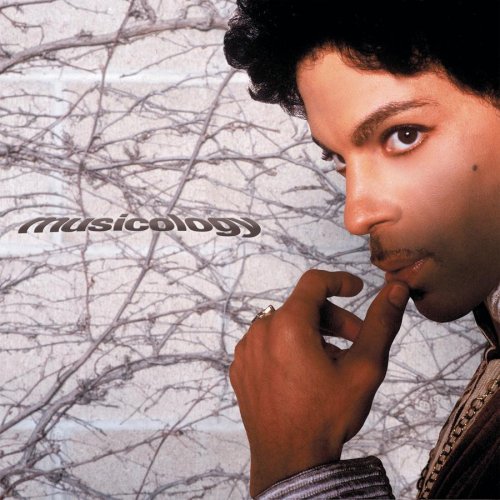
Mat Maitland's artwork for FALLINLOVE2NITE |
- E-mail - orgNote -  Report post to moderator Report post to moderator |
It's very "Watchtower" LOL | |
- E-mail - orgNote -  Report post to moderator Report post to moderator |
Check out the images on his website - he did a MJ pic that is very similar to this including the gold rings and floating gold nuggets. | |
- E-mail - orgNote -  Report post to moderator Report post to moderator |
..and cheesy half ass artwork to fit the song. Sure why not. | |
- E-mail - orgNote -  Report post to moderator Report post to moderator |
The clouds, too.. interesting. Everybody stop on the 1...GOOD GOD! Uhh! | |
- E-mail - orgNote -  Report post to moderator Report post to moderator |
Cool to know. However the clouds are cool and the rings but the mountain image is just stupid.
Overall pretty cheesy but no where as bad as this
The greatest live performer of our times was is and always will be Prince.
Remember there is only one destination and that place is U All of it. Everything. Is U. | |
- E-mail - orgNote -  Report post to moderator Report post to moderator |
What's so bad about that? Everybody stop on the 1...GOOD GOD! Uhh! | |
- E-mail - orgNote -  Report post to moderator Report post to moderator |
2020 said: Cool to know. However the clouds are cool and the rings but the mountain image is just stupid.
Overall pretty cheesy but no where as bad as this
I don't know what you mean by "stupid" so I cannot agree with you, but I think it looks too dirty. What? | |
- E-mail - orgNote -  Report post to moderator Report post to moderator |
^ The mountain. What? | |
- E-mail - orgNote -  Report post to moderator Report post to moderator |
I'm failing to understand what you mean by this. lol [Edited 3/19/14 16:56pm] Everybody stop on the 1...GOOD GOD! Uhh! | |
- E-mail - orgNote -  Report post to moderator Report post to moderator |
Oh. [Edited 3/19/14 16:56pm] Everybody stop on the 1...GOOD GOD! Uhh! | |
- E-mail - orgNote -  Report post to moderator Report post to moderator |
Bambi82 said:
I'm failing to understand why you mean by this. lol That a mountain with grass and flowers and Julie Andrews on it would have looked better to me. What? | |
- E-mail - orgNote -  Report post to moderator Report post to moderator |
my first thought was lord of the rings. hmmm. so those 2 circles are mirrors reflecting the gold, which itself seems to have reflections in it just beyond my discernment. one looks like a mouth and some look like hearts? very yin yang, i dig the purple in his hair, and i LOVE clouds! flowing through the veins of the tree of life...purplemaplesyrup | |
- E-mail - orgNote -  Report post to moderator Report post to moderator |
The artwork is cool...I like it. | |
- E-mail - orgNote -  Report post to moderator Report post to moderator |
I dont like it. And whats up with the evil face in the mountain I will take my place, In the great below | |
- E-mail - orgNote -  Report post to moderator Report post to moderator |
you would think someone who proclaims the virtues of real music by real musicians would hire real artists for his album covers.. | |
- E-mail - orgNote -  Report post to moderator Report post to moderator |
Huh. Okay let me see: the stretched font, the photo sticking out from the background, the really bad lighting effect applied on his face, poor resolution for the font and the background image and it doesn't make much sense conceptually (uhm, vines?). The booklet inside looked fine though. It's hard to see why the cover was so amateurish. It's like he was given a sketch and Prince said "Use that! No more work on it!". | |
- E-mail - orgNote -  Report post to moderator Report post to moderator |
Double huh. The single artwork is based entirely on the Michael Jackson image the artist has done earlier. He's just substituted Prince for MJ and the mountains and the clouds for the chimps. | |
- E-mail - orgNote -  Report post to moderator Report post to moderator |
the fingers shaping a heart is betta | |
- E-mail - orgNote -  Report post to moderator Report post to moderator |
It's amazing what you can do with MS Paint these days. | |
- E-mail - orgNote -  Report post to moderator Report post to moderator |
Freaky!! "Just like the sun, the Rainbow Children rise."
"We had fun, didn't we?" -Prince (1958-2016) 4ever in my life | |
- E-mail - orgNote -  Report post to moderator Report post to moderator |
 New topic
 Printable
 moderator
