| Author | Message |
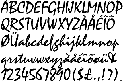
Anyone else notice... ...the use of a font used on the Purple Rain LP in the titles for the Ryan Gosling movie Drive?
[Edited 1/6/12 10:46am] [Edited 1/6/12 10:49am] | |
- E-mail - orgNote -  Report post to moderator Report post to moderator |
The soundtrack is PURE 80's synth driven as well. So is the cinematography (neon galore). The director stated that he was going for an 80's Michael Mann feel. He succeeded.
.
[Edited 12/29/11 14:53pm] "Climb in my fur." | |
- E-mail - orgNote -  Report post to moderator Report post to moderator |
I see that font used quite a lot. I don't think Prince has any trademark claim on it, so it's just part of the public domain of fonts, just like Arial, Times New Roman, and Comic Sans. "I Was FINE Back in the Day!" | |
- E-mail - orgNote -  Report post to moderator Report post to moderator |
Never said he did, just thought it was a lovely subtle touch from a movie with its heart in the 80's | |
- E-mail - orgNote -  Report post to moderator Report post to moderator |
I do remember them using that font, I also remember that noticing it was the one and only time during the entire movie that I felt slightly impressed. It was just endless shots of Ryan Gosling being the strong, silent and broody type, (Snore) interspersed with sketchy moments of very weak plot. The font was nice though. | |
- E-mail - orgNote -  Report post to moderator Report post to moderator |
Those two stupid lfamo 2whatevr, they used the font for that party rock thing to  is Sexy. Period. is Sexy. Period. | |
- E-mail - orgNote -  Report post to moderator Report post to moderator |
Haha, no I didn't notice. Pretty cool Yes, at 19, I finally saw the Revolution, a legendary band. And I talked to Wendy!!! | |
- E-mail - orgNote -  Report post to moderator Report post to moderator |
That's NOT the same font. | |
- E-mail - orgNote -  Report post to moderator Report post to moderator |
According to the director, it's the Risky Business font.
http://newyork.timeout.com/arts-culture/film/1950483/drives-nicolas-winding-refn
“My editor suggested the film’s font…he stole it from Risky Business. It also reminded me of a film that made a very big impression on me when I was young: Pretty in Pink. John Hughes’s movies were very much my coming-of-age films, and I think Drive has a lot of him in it. It’s like a John Hughes movie where heads get smashed."
| |
- E-mail - orgNote -  Report post to moderator Report post to moderator |
PositivityForever said: That's NOT the same font. | |
- E-mail - orgNote -  Report post to moderator Report post to moderator |
This! | |
- E-mail - orgNote -  Report post to moderator Report post to moderator |
watch lmfao party rock anthem thats the same font on there t shirts. All of this and more is 4 u. With <3, sincerity and deepest care, my life with u eye share ~Prince~
Life is time time is space and space is what Eye need ~Awesome A.V~ | |
- E-mail - orgNote -  Report post to moderator Report post to moderator |
[img:$uid]http://img24.imageshack.us/img24/4185/69582535.gif[/img:$uid]
I just made this using a font called "Nikki" which is one I got with a pack of Prince fonts and as I understand it, it was used 4 the liner notes on the Purple Rain album.
Not saying U're wrong, just that's what it is. | |
- E-mail - orgNote -  Report post to moderator Report post to moderator |
innit...watched Drive t'other day and said to the old wifey that it was the Purple Rain writing - just got 'the look' (alas, not 'that look') - as it was, and she dislikes me finding things Prince related as it just encourages me!! Comin str8 outta Preston... | |
- E-mail - orgNote -  Report post to moderator Report post to moderator |
Purple Rain font is much pointier/sharper and a different design overall
| |
- E-mail - orgNote -  Report post to moderator Report post to moderator |
It's closer to the Mistral font. Most letters in "Drive" match, except for the "r".
[Edited 12/31/11 10:37am] | |
- E-mail - orgNote -  Report post to moderator Report post to moderator |
Strange, the letters "e" and "i" in "Risky Business" don't match the ones in "Drive". Magnify the fonts of both posters and you'll see that "Drive" matches the Mistral font. | |
- E-mail - orgNote -  Report post to moderator Report post to moderator |
Such a pedantic bunch on Prince.org I forgot...
Yes its the font used on the album cover just not the front cover sheesh
So yes it is one of the fonts used on Purple Rain | |
- E-mail - orgNote -  Report post to moderator Report post to moderator |
Okay, i stand corrected. I wasn't aware in the first post that it was about the font on the back cover. No need to snark though. Misunderstandings can happen.
[Edited 1/5/12 13:11pm] | |
- E-mail - orgNote -  Report post to moderator Report post to moderator |
I've edited the OP to avoid more of the same. | |
- E-mail - orgNote -  Report post to moderator Report post to moderator |
| |
- E-mail - orgNote -  Report post to moderator Report post to moderator |
 New topic
 Printable


