 This is a "featured" topic! — From here you can jump to the « previous or next » featured topic.
 New topic
  Printable
 love2thenines2003 said: I  this album cover. this album cover.
I really luv the design and the great~electric colors.  | |
- E-mail - orgNote -  Report post to moderator Report post to moderator |
paisleypark4 said: Zannaloaf said: Ya got me on the first one. I never liked that cover. But Innervisions is nicer art imo. And better composition.I as thinking Talking Book, Fulfillingness' First Finale and Songs in the Key of Life. It is closer to EWF in the 70s/80s, just not as interesting in it's complexity or style. I never liked that Innvervisions cover. (glad people finally coming up that have sense in this forum)...it just seems.....bland or ..I dont know..odd...I always hated the Songs In The Key Of Life cover too...just terrible. I dig Innervisions' cover only for the fact that it seems to illustrate what has always struck me about Stevie's music: He can out-write most sighted people about what he's seeing, his songs are so descriptive. I like the color and space given to the layout of the Prince album. I don't think it's original, but it's eye-catching at least. | |
| - E-mail - orgNote - Report post to moderator |
Alexandernvrmind said: thank goodness hes not in a girdle or bustier or naked on blossoming flower or completely fagged out like on New Powersoul

 | |
| - E-mail - orgNote - Report post to moderator |

| - E-mail - orgNote - Report post to moderator |

I like it.....but it's the music that matters more to me ~Kostas a.k.a. Glamslam@HQ~ | |
| - E-mail - orgNote - Report post to moderator |

I like it!!! now I wanna know how much!!?? and when??? Forever in my life... | |
| - E-mail - orgNote - Report post to moderator |

paisleypark4 said: Zannaloaf said: Ya got me on the first one. I never liked that cover. But Innervisions is nicer art imo. And better composition.I as thinking Talking Book, Fulfillingness' First Finale and Songs in the Key of Life. It is closer to EWF in the 70s/80s, just not as interesting in it's complexity or style. I never liked that Innvervisions cover. (glad people finally coming up that have sense in this forum)...it just seems.....bland or ..I dont know..odd...I always hated the Songs In The Key Of Life cover too...just terrible. personal preference all - but Innervisions has SPACE around it party because the art is fairly detailed is seen large. If you bought the vinyl it looked great imo. Songs is not my fave, but it said something at the time and was cohesive. Lotusflower is not that - cohesive. Just looks like they took a square chunk and adapted it rather than rearranging to fit the space. For my not digging concept on last few cd covers they LOOKED like they were made to work in their spaces. To me it is just laziness to not at least move things around some. Or lose the items left and right making the main image bigger. Of course I bet the web guys are like.."Print resolution..? Um...we made this for the web man...."...lol. | |
| - E-mail - orgNote - Report post to moderator |
glamslam13 said: I like it.....but it's the music that matters more to me
Nice 2 see u again my friend! | |
| - E-mail - orgNote - Report post to moderator |
zucris said:
I like it!!! now I wanna know how much!!?? and when??? How Much > ? When> somewhere in late March/April on cds i guess! | |
| - E-mail - orgNote - Report post to moderator |
love2thenines2003 said: zucris said:
I like it!!! now I wanna know how much!!?? and when??? How Much > ? When> somewhere in late March/April on cds i guess! Thank u... I have to wait more time I guess here in Arg Forever in my life... | |
| - E-mail - orgNote - Report post to moderator |
love2thenines2003 said: glamslam13 said: I like it.....but it's the music that matters more to me
Nice 2 see u again my friend! ~Kostas a.k.a. Glamslam@HQ~ | |
| - E-mail - orgNote - Report post to moderator |
I like it. Hopefully it's indicative of his mindset for the music. | |
| - E-mail - orgNote - Report post to moderator |

glamslam13 said: I like it.....but it's the music that matters more to me
what up kostas ..and welcome  man, he has such an amazing body of music that it's sad to see him constrict it down to the basics. he's too talented for the lineup he's doing. estelle 81 | |
| - E-mail - orgNote - Report post to moderator |

Pretty shitty. | |
| - E-mail - orgNote - Report post to moderator |

Zannaloaf said: paisleypark4 said: I never liked that Innvervisions cover. (glad people finally coming up that have sense in this forum)...it just seems.....bland or ..I dont know..odd...I always hated the Songs In The Key Of Life cover too...just terrible. personal preference all - but Innervisions has SPACE around it party because the art is fairly detailed is seen large. If you bought the vinyl it looked great imo. Songs is not my fave, but it said something at the time and was cohesive. Lotusflower is not that - cohesive. Just looks like they took a square chunk and adapted it rather than rearranging to fit the space. For my not digging concept on last few cd covers they LOOKED like they were made to work in their spaces. To me it is just laziness to not at least move things around some. Or lose the items left and right making the main image bigger. Of course I bet the web guys are like.."Print resolution..? Um...we made this for the web man...."...lol. Well I do have the vinyl and still...I just dontlike the pebble stone art..ugh I don't like it...way too much space misused... The colors I just didnt like either. i didnt like the Talking Book cover either....where is he in Jarusalem or something, and that terrible 70's brown fame background...lord. Lol. Good album though. Stevie never really had a bad album. And it's always about the music in the end. J.Lo's 2nd album had one of the best covers in 2000 but the album was just not that great! Straight Jacket Funk Affair
Album plays and love for vinyl records. | |
| - E-mail - orgNote - Report post to moderator |

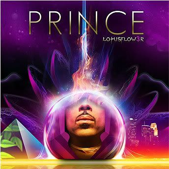
I don't like the art. The sublimity of a lotus -- physical, spiritual or otherwise -- resides in its simplicity. Yet this cover looks like rush hour in Manila. Less is often more: The art with no lettering at all would be captivating to most viewers... and any fan would recognize Prince's ubiquitous mug as an ID without his name sprawled out in bad '70s sci-fi lettering. Or better still: Why not a simple black field with a single tiny and gorgeous lotus dropped somewhere? Lettering, if necessary, could be equally small and tone on tone -- something intriguing in its very understatedness. Ὅσον ζῇς φαίνου
μηδὲν ὅλως σὺ λυποῦ πρὸς ὀλίγον ἐστὶ τὸ ζῆν τὸ τέλος ὁ χρόνος ἀπαιτεῖ.” | |
| - E-mail - orgNote - Report post to moderator |

Lammastide said: I don't like the art. The sublimity of a lotus -- physical, spiritual or otherwise -- resides in its simplicity. Yet this cover looks like rush hour in Manila.
Less is often more: The art with no lettering at all would be captivating to most viewers... and any fan would recognize Prince's ubiquitous mug as an ID without his name sprawled out in bad '70s sci-fi lettering. Or better still: Why not a simple black field with a single tiny and gorgeous lotus dropped somewhere? Lettering, if necessary, could be equally small and tone on tone -- something intriguing in its very understatedness. I definately agree with the less is more analargy, and not bad suggestions. I kinda like the organic quality of Sigur Ros sleeves. Even if the texture of the cover was a bit different. | |
| - E-mail - orgNote - Report post to moderator |

glamslam13 said: I like it.....but it's the music that matters more to me
The same with me. This is just extra, albeit necessary stuff. I'm not a fan of "old Prince". I'm not a fan of "new Prince". I'm just a fan of Prince. Simple as that | |
| - E-mail - orgNote - Report post to moderator |

Lammastide said: I don't like the art. The sublimity of a lotus -- physical, spiritual or otherwise -- resides in its simplicity. Yet this cover looks like rush hour in Manila.
Less is often more: The art with no lettering at all would be captivating to most viewers... and any fan would recognize Prince's ubiquitous mug as an ID without his name sprawled out in bad '70s sci-fi lettering. Or better still: Why not a simple black field with a single tiny and gorgeous lotus dropped somewhere? Lettering, if necessary, could be equally small and tone on tone -- something intriguing in its very understatedness. Dude, that would be understated and cool - something that Prince obviously is not. He's all about the garish and tacky it would seem. | |
| - E-mail - orgNote - Report post to moderator |
Anxiety said: i like the font they used for his name.
i believe its Futura if im not mistaken | |
| - E-mail - orgNote - Report post to moderator |
shausler said: Anxiety said: i like the font they used for his name.
i believe its Futura if im not mistaken The N is too narrow and the diagonal leg of the R is too far from the vertical leg, but it is definitely an offshoot/variation of Adobe's Futura. Someone suggested that it's Uptown Girl, but I don't think it is. If prince.org were to be made idiot proof, someone would just invent a better idiot. | |
| - E-mail - orgNote - Report post to moderator |

i remember a very beautiful, sleak photograph of prince standing
on the edge of a pool, with his lips close to the water. that would make a brilliant cover. a single lotusflower on the water to top it off. and true love lives on lollipops and crisps | |
| - E-mail - orgNote - Report post to moderator |

^ Ah, that Rave era picture ~Kostas a.k.a. Glamslam@HQ~ | |
| - E-mail - orgNote - Report post to moderator |
you get music in a physical form you complain at least it's better than TRC him in the kermit green turtleneck on the spine of the cd | |
| - E-mail - orgNote - Report post to moderator |

utopia7 said: you get music in a physical form you complain
at least it's better than TRC him in the kermit green turtleneck on the spine of the cd I thought the TRC packaging was great, turtleneck and all. Ὅσον ζῇς φαίνου
μηδὲν ὅλως σὺ λυποῦ πρὸς ὀλίγον ἐστὶ τὸ ζῆν τὸ τέλος ὁ χρόνος ἀπαιτεῖ.” | |
| - E-mail - orgNote - Report post to moderator |
Lammastide said: utopia7 said: you get music in a physical form you complain
at least it's better than TRC him in the kermit green turtleneck on the spine of the cd I thought the TRC packaging was great, turtleneck and all. I was suprised as hell seeing him on the side! So mysterious! Straight Jacket Funk Affair
Album plays and love for vinyl records. | |
| - E-mail - orgNote - Report post to moderator |
Lammastide said: I don't like the art. The sublimity of a lotus -- physical, spiritual or otherwise -- resides in its simplicity. Yet this cover looks like rush hour in Manila.
Less is often more: The art with no lettering at all would be captivating to most viewers... and any fan would recognize Prince's ubiquitous mug as an ID without his name sprawled out in bad '70s sci-fi lettering. Or better still: Why not a simple black field with a single tiny and gorgeous lotus dropped somewhere? Lettering, if necessary, could be equally small and tone on tone -- something intriguing in its very understatedness. I like the idea of no text. The art is very vibrant and I think it works. Could be something as simple as the name of the album being only on the label (like The Black Album or the balloon boy on ATWIAD). | |
| - E-mail - orgNote - Report post to moderator |

Lammastide said: I don't like the art. The sublimity of a lotus -- physical, spiritual or otherwise -- resides in its simplicity. Yet this cover looks like rush hour in Manila.
Less is often more: The art with no lettering at all would be captivating to most viewers... and any fan would recognize Prince's ubiquitous mug as an ID without his name sprawled out in bad '70s sci-fi lettering. Or better still: Why not a simple black field with a single tiny and gorgeous lotus dropped somewhere? Lettering, if necessary, could be equally small and tone on tone -- something intriguing in its very understatedness. Then everyone would complain it was too simple. Christian Zombie Vampires | |
| - E-mail - orgNote - Report post to moderator |

I like the art. IMO it's better than the artwork of the last three (except for the booklet in 3121).
I dunno, it's pretty, obviously digital and conveys a few themes. But his artwork has usually been this way. A panache of different things...a collage as he likes to convey different things in one setting. I can think of several Albums where he uses this style in varied ways... 1999 ATWIAD SOTT Graffiti Bridge Inside of Emancipation Chaos and Disorder Mostly, I think his art can be hit or miss depending on your tastes. I think the first 4 album artwork is pretty boring, except for Dirty Mind. But for the most part it's just him. PR was a big yawn. Parade was interesting, as was Lovesexy (My favorite). But covers like D&P, NPS, Rave, Gold Experience, CB, News etc have been pretty shitty. So I wonder where all the angst comes from, it's not like his covers have been stellar to begin with. Christian Zombie Vampires | |
| - E-mail - orgNote - Report post to moderator |
superspaceboy said: I like the art. IMO it's better than the artwork of the last three (except for the booklet in 3121).
I dunno, it's pretty, obviously digital and conveys a few themes. But his artwork has usually been this way. A panache of different things...a collage as he likes to convey different things in one setting. I can think of several Albums where he uses this style in varied ways... 1999 ATWIAD SOTT Graffiti Bridge Inside of Emancipation Chaos and Disorder Mostly, I think his art can be hit or miss depending on your tastes. I think the first 4 album artwork is pretty boring, except for Dirty Mind. But for the most part it's just him. PR was a big yawn. Parade was interesting, as was Lovesexy (My favorite). But covers like D&P, NPS, Rave, Gold Experience, CB, News etc have been pretty shitty. So I wonder where all the angst comes from, it's not like his covers have been stellar to begin with. Ok, point taken, but lets face it, taht pyramid is fucking ridiculous. The best album artwork is sott face down. And for all the people who actuily like this cover, the simple fact is their taste is in their arse. | |
| - E-mail - orgNote - Report post to moderator |
New topic Printable This is a "featured" topic! — From here you can jump to the « previous or next » featured topic.