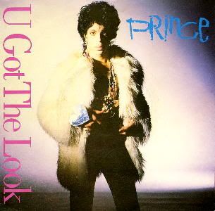
I think the album covers pretty much speak for themselves...


. [Edited 1/26/06 6:20am] | |
- E-mail - orgNote -  Report post to moderator Report post to moderator |
was that xpectation cover legit? i don't remember getting any artwork files with the downloads, or seeing the art on NPGMC... | |
- E-mail - orgNote -  Report post to moderator Report post to moderator |
Anx said: was that xpectation cover legit? i don't remember getting any artwork files with the downloads, or seeing the art on NPGMC...
Yes, it is legit. The image appeared several times on NPGMC, but never very big or in decent quality. It's the same cover image that was used when the album was called Xenophobia, and if you go to the NPGMC's discography section the Xpectation cover is displayed there as well. | |
- E-mail - orgNote -  Report post to moderator Report post to moderator |
BorisFishpaw said: Anx said: was that xpectation cover legit? i don't remember getting any artwork files with the downloads, or seeing the art on NPGMC...
Yes, it is legit. The image appeared several times on NPGMC, but never very big or in decent quality. It's the same cover image that was used when the album was called Xenophobia, and if you go to the NPGMC's discography section the Xpectation cover is displayed there as well. aha! i remember that now. yeah, that art is in 'the vault' room. thanks, boris. | |
- E-mail - orgNote -  Report post to moderator Report post to moderator |
stim said: The design on the post WB albums is definitely worse. You've got the Photoshop overkill of Emancipation and the 'tossed-off-in-5-minutes-before-lunch' Photoshop of Musicology. The typography is awful. He really needs to get someone in with a good knowledge of type.
I have a theory - it's not just Prince who's album artwork is suffering after entering the 90s. It's across the board. I'm going to sound like an old fart for saying this but the decline in the quality of album sleeve artwork coincided with the decline of vinyl. The 12 inch format lent itself so much better to creative graphic design. From the 60s to the 80s there were some great album covers - real iconic stuff. You kind of lose the impact with CDs. There's also the rise of digital tools like Photoshop to consider. I'm not saying there are no more great album covers. It's just that they're a lot rarer than they used to be. A lot of the imagery, type and colours that represent a genre of music are more or less set in stone nowadays. Go into a music store and look at the racks for a certain genre (Hip Hop, Metal, anything) from a distance and you'll see how similar a lot of the jacket designs look. There's a general lack of thinking out of the box and risk taking. End of ramble. [Edited 1/26/06 1:47am] I really agree with you here though it's interesting if you look at the type of "Dirty Mind" album cover for example. What is that font exactly?? Yet somehow in true Prince style it works. Shut up already, damn. | |
- E-mail - orgNote -  Report post to moderator Report post to moderator |
pepper7 said: I really agree with you here though it's interesting if you look at the type of "Dirty Mind" album cover for example. What is that font exactly?? Yet somehow in true Prince style it works. i think back then, display/title fonts like that were done by hand. at the very least, they were custom-created a lot of the time. | |
- E-mail - orgNote -  Report post to moderator Report post to moderator |
What I miss is the themes (mostly prevalent in ATWIAD/Parade and Batman eras, however) - the single covers artistically matching the album. For example:
[No hotlinking! Upload them to your own server like photobucket - BananaCologne] or: [No hotlinking! Upload them to your own server like photobucket - BananaCologne] Compared to, say: with the single: Or even: with the singles: [No hotlinking! Upload them to your own server like photobucket - BananaCologne] Where's the consistency - the theme? | |
- E-mail - orgNote -  Report post to moderator Report post to moderator |
booyah said: What I miss is the themes (mostly prevalent in ATWIAD/Parade and Batman eras, however) - the single covers artistically matching the album.
Where's the consistency - the theme? i miss that, too. i guess now that singles don't sell the way they used to and don't have the same visibility they had in the past, it doesn't matter. | |
- E-mail - orgNote -  Report post to moderator Report post to moderator |
Anx said: booyah said: What I miss is the themes (mostly prevalent in ATWIAD/Parade and Batman eras, however) - the single covers artistically matching the album.
Where's the consistency - the theme? i miss that, too. i guess now that singles don't sell the way they used to and don't have the same visibility they had in the past, it doesn't matter. I would imagine, though, that if you own an album, a single with a similar design would catch your attention, and you'd be more likely to pick it up (as long as there's some reason to, such as extra tracks, which is a different story). Alternatively, however, and this is more the point of singles - if you buy a single (even digitally, with artwork), and like it, you'd be more likely to spot the album if the design is related. As a die-hard fan, it's hard to think like a non-fan, since I will buy Prince albums regardless, but this makes sense to me. | |
- E-mail - orgNote -  Report post to moderator Report post to moderator |
Well...He never did some classy covers like there:
 | |
- E-mail - orgNote -  Report post to moderator Report post to moderator |
...Oh I don't know...
  [Edited 1/26/06 6:50am] | |
- E-mail - orgNote -  Report post to moderator Report post to moderator |
BorisFishpaw said: ...Oh I don't know...
 
[Edited 1/26/06 6:50am] At least when I look at Cleo I get the idea that she saying this: "Hey whitey...I wanna fuck U hard!" | |
- E-mail - orgNote -  Report post to moderator Report post to moderator |
BorisFishpaw said: ...Oh I don't know...
 
and true love lives on lollipops and crisps | |
- E-mail - orgNote -  Report post to moderator Report post to moderator |
since he left WB I think its been kinda plain and boring to be honest. The best cover is Dirty Mind, or Lovesexy. Did you order a pizza ma'am? Prince- UTCM | |
- E-mail - orgNote -  Report post to moderator Report post to moderator |
They say you cant judge a book by its cover, but with Prince's work over the past 15 years,...i dont know..... | |
- E-mail - orgNote -  Report post to moderator Report post to moderator |
Better with WB. He needs a competent staff to do the artwork. Steve Parke and them leave a lot to be desired. | |
- E-mail - orgNote -  Report post to moderator Report post to moderator |
Well, it depends imo. Btw, what is meant by "WB days"? Everything up to 1992 or also WB releases afterwards (I tend to go by the latter)?
O.k., my 2 cents (official retail Prince or O+> releases only): WB releases For you - Not bad Prince - Absolutely horrible! Worst cover ever! Something to show your non-Prince-fans friends to give them a laugh! Dirty Mind - Completely dated! May have been cool at the time, but only good for a laugh nowadays imo. Controversy - Pretty cool 1999 - Horrible imo (I know that will bring me hate). Doesn't fit the mood of the album in any way. Purple Rain - Classic ATWIAD - Great Parade - O.k., but I've never completely liked the black and white thing for Prince. SOTT - Good as it compliments the overall theme of the album pretty well. Lovesexy - Classic Batman - I tend not to count it as its look had to be dominated by the movie anyway. GB - I like it. It has that nice late 80's touch. D&P - cool O+> - Great. One of my favourite Prince album covers ever. The Hits - Somehow disappointing. Come - I've never liked that he overdid that "Prince is dead" thing so much. A little bit too extreme imo. But it's much better than the music in this case... The Black Album - See comment for C&D... TGE - Not bad, but given the "Gold" topic, a little disappointing. Chaos and Disorder - Pretty much resembles the album title, doesn't it? The Vault - Horrible The Very Best of Prince - Much better for a compilation than that "The Hits" artwork. Non-WB releases Emancipation - The concept isn't bad (the broken chains), but that orange color really tends to be annoying. Crystal Ball - He obviously wanted a bootleg look, and he succeeded... Rave - I just like that blue jumpsuit... TRC - One of his best album covers ever imo. ONA live - Nice, very noble artwork overall. NEWS - Not bad, but not exciting. Musicology - Horrible. Was that created randomly by a computer? Out of competition - The three NPG albums Goldnigga - Not bad Exodus - Great NPS - Horrible. I can't really understand that as the rest of the artwork is much better imo. So, overall, pretty mixed impressions. I tend to come to the same conclusion for his videos, but that's a different story... [Edited 1/29/06 11:01am] [Edited 2/4/06 3:16am]  | |
- E-mail - orgNote -  Report post to moderator Report post to moderator |
Mostly they're pretty good except for 1999, Graffiti Bridge, and the Vault. And what's with the Rave cover hate. That's an awesome cover. Really cool package too. Don't hurt me, I'm a newb. I'm supposed to be stupid. | |
- E-mail - orgNote -  Report post to moderator Report post to moderator |

Good cover, but not great. has a good sense of mystery about it though. 
OK cover, a little ordinary though. 
Excellent cover! It visually ties in with the content of the album. The black and white image, the bedsprings backdrop and the typography all reflect the punk-funk new-wave music. 
Never was particularly keen on this one, very disappointing after Dirty Mind. Prince's face is over airbrushed (and too orange). Would've been better if the whole cover had been made to look like a newspaper cover like that Tom Waits album or the G'n'R Lies cover. 
Great cover. A modern, more abstract take on the hand drawn Funkadelic style. Plus the big introduction to the color purple being associated with Prince. 
Great cover. Iconic image, though personally I prefer it without the flower borders (like on the Let's Go Crazy single). 
Great cover. Another great hand drawn concept. Fits perfectly with the psychedelic beatlesque vibe of the album. 
Great cover. Another iconic image. A great minimalist reaction against the busy colorful previous album. 
Excellent cover! Probably my personal favorite. My only gripe is that some of the elements added afterwards could've been blended in better, but image wise it was fantastic. 
Great cover. Another iconic image. Personally I think framing of the image is a little too central and upright, but again that's just a minor personal gripe. 
Good use of the Batman logo image, though obviously 100% 'Batman' and no 'Prince'. 
OK cover. Well executed, but for some reason I never really liked it that much. 
Good cover. Simple classy photography that reflects the more produced and commercial content (Personally I'd have prefered the original full color version of the cover rather than the blue halftone, but that's just a personal thing). 
Great cover. I like the way the symbol fits into the image on the cover (which is a still from the 7 video). The image complements the theme of the album. 
Good cover. Simple classic photography, possibly a little plain though (personally I would've used a sepia version of the 'bond' pose shot from the  album booklet for something called 'Hits') album booklet for something called 'Hits')

Good cover. Let down a bit by kinda boring typography, (but definitely a big improvement on the original cover). 
Good cover. good concept, though a bit 'spinal tap'. 
OK cover. Actually looked really good when it was printed on foil paper as originally intended, doesn't work so well without the metallic look. Also not so keen on the typography. 
Poor cover. Well it fits with the title and music, but even so, it just doesn't 'feel' like a 'Prince' album cover. 
Poor cover. The concept is fine, but the execution is a bit blurred and lacking in depth. Image is just lifted from the old 'The Dawn' website. 
OK cover. Works well enough when used in the circular case, but again the exacution is a bit basic. 
Poor cover. Like Chaos And Disorder, it does actually fit with the music, it just isn't very inspiring. 
Poor cover. just looks thrown together, the layout, image and typography just don't seem to gel in an aesthetically pleasing way. 
Poor cover. Another thrown together image. Totally uninspiring (and cheap looking). 
Great cover. Really great painting, and a great image for the album. Unfortunately the execution is a bit poor with the awkward angled borders. It would've been much better just to use the image flat on the cover. 
Good cover. Actually really well done, but what the hell does it mean? 
OK cover. Nice image, but it does look like he's kinda sucking a lemon. A little plain looking. 
Good cover. I really like the layered-type orange/brown images made for this album. Pity it was never released in hard format. 
Poor cover. Very basic looking, and the typography looks blurred and indistinct. 
Poor cover. Horrible typography and poor background choice. Actually the inside of the booklet is much better and puts the cover to shame. . | |
- E-mail - orgNote -  Report post to moderator Report post to moderator |

Cheesy bad 70's. Looks like a 1978 tv special from a tube cam, where's the Captain & Tenille?. 
Great, I can't argue with a simple well done portrait, it's always classy and it is the person behind what you are about to hear.. 
Fine Art. 
A bit cheaper version of the whole portrait idea mixed with a concept, if the newspaper had had more depth or torn parts or bent corners and shadows, it would have been better. 
fine Art 
Fine Art, I love the flowers used throughout this campaign (even in the grammy Baby I'm a Star performance) the flowers look like a visual representation of the flanged wild beats of When doves Cry... shit did I do too much acid? 
Fine Art. 
Fine Art, and pefect for the 80's 
Fine art... Boris, which elements are not incorporated well? 
Fine Art, this image is so dynamic, and crazy potent, and to me the central framing is crucial to it... and the flowers don't evoke Purple Rain, but still seem to shape the perception of the sound of the album.... 
Cropping this movie poster was a cool idea 
Poo Poo, its like bad art! It's like community college art! 
this was the European version cover? It's beautiful... but the album doesn't sound so blue. 
Poop, community college art... 
Too much like a Madonna photo... 
Fine Art 
Fine Art to the max 
Dookie, like intro to photoshop. 
Elementary School Art, in a bad way... no strike that, it's not any kind of art, i don't read any mood... 
This is so commercial glamourshot whitney houston boring tacky, yuck, I would listen to this album so much more if it had a different cover 
Photoshop of convenience store quality 
Ugly to the nth degree... yuck, maybe its like a carnival? How depressing. 
Typography just sinks this cover.... he looks like a worm torso of blue glitter with ribbons.. where's New Power Soul? should have used the boxing photo of that shoot... 
Fine Art, perfect for this album, who did it? 
this is the kind of shit I see when interviewing an art intern. Horrible, no-taste cover, yuck, blah, grrrr 
mature... okay... but boring... but tastful 
were they inspired by MTV news? This is doing nothing to create any kind of mystique, and ruins the music with its connection 
I can't get over how cheap the logo "musicology" is designed... NO! My art book: http://www.lulu.com/spotl...ecomicskid
VIDEO WORK: http://sharadkantpatel.com MUSIC: https://soundcloud.com/ufoclub1977 | |
- E-mail - orgNote -  Report post to moderator Report post to moderator |
ufoclub said: 
Fine art... Boris, which elements are not incorporated well? It's merely a technical thing (not compositional). Where the guitar strap disappears behind prince's shoulder, it cuts off with a hard edge, but because Prince is close to camera and out of focus, it should disappear with a blurred edge. Like I said it's merely a technical point, but it attracts attention to the fact that the guitar was superimposed on afterwards. 
Fine Art, this image is so dynamic, and crazy potent, and to me the central framing is crucial to it... and the flowers don't evoke Purple Rain, but still seem to shape the perception of the sound of the album.... Personally I just feel because his body is so central it actually makes it look as if he's too far over to the left of the picture. I just think from a compositional point of view it would look better if he was framed a bit more to the right, and tilted just a few degrees right as well to make him a bit more 'reclined'. 
this was the European version cover? It's beautiful... but the album doesn't sound so blue. The holographic sleeve was initially intended to be a limited run just for the duration of the album's normal lifespan. This Blue sleeve would have replaced it when the holograms had run out (it's also the sleeve for the vinyl version which was never released with the hologram sleeve). In the end though, they ended up reprinting the hologram sleeve, so the 'normal' 'blue' sleeve is now rarer than the 'limited' holographic sleeve. | |
- E-mail - orgNote -  Report post to moderator Report post to moderator |
NEWS and The Rainbow Children were nice covers,
and so was Emancipation, imho. But overall, the WB-era covers are the best! Parade, 1999, SOTT, I even liked Graffiti Bridge and  555-4444 you're on coffee talk. | |
- E-mail - orgNote -  Report post to moderator Report post to moderator |
BorisFishpaw said: I think the album covers pretty much speak for themselves...


. [Edited 1/26/06 6:20am] The Parade cover got flipped there Boris. Prince should be pictured horizontally, popping into picture from the left side! 555-4444 you're on coffee talk. | |
- E-mail - orgNote -  Report post to moderator Report post to moderator |
antoon said: The Parade cover got flipped there Boris. Prince should be pictured horizontally, popping into picture from the left side! No he shouldn't... the image is designed as a reversable vertical gatefold. The way I've pictured it is the correct way it should be viewed. The same applies to Michael Jackson's Off The Wall, Jimi Hendrix's Axis: Bold as Love and Diana Ross' Diana to name but a few. | |
- E-mail - orgNote -  Report post to moderator Report post to moderator |
BorisFishpaw said: ...Oh I don't know...
 
[Edited 1/26/06 6:50am] | |
- E-mail - orgNote -  Report post to moderator Report post to moderator |
 New topic
 Printable