 New topic
 Printable
| Author | Message |
WORST PRINCE/ASSOCIATED ARTIST ALBUM COVER I came across Pitchfork's Worst Album Covers List and was actually disappointed that there was no Prince or Prince Protégé album cover in there. True, there is so much to choose from, but still there's been some pretty bad album covers.
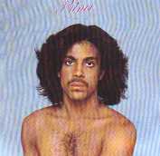
In Prince's case, New Power Soul and Rave on the the Joy Fantastic are pretty bd, and Prince (the album) is also close to awful. 

Don't you agree? As for associated artists (and please keep this thread in this forum, because Prince most likely played a part in the concept or approval of the artwork), I have to say Romance 1600 is pretty kitsch : 
And then, there is Mazarati, which is not really bad but sticks like a sore thumb in the Paisley Park catalog : 
Actually, the eyes are very spooky! | |
- E-mail - orgNote -  Report post to moderator Report post to moderator |

Yeah Rave and NPS are both pretty bad. The gold experience is bad too. | |
| - E-mail - orgNote - Report post to moderator |
I agree wholeheartedly with your examples, Aerogram.
But the following might be his worst: 
It reminds me of a freshman art-class project in metaphor. Then there is this one: 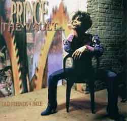
Great artists could take the themes of anger and soured relationships and make something quite memorable. What we have here instead is what so much of his artwork has been over the last decade, rather literal, amateurish piecemeal that's as off-key with the music as a dirty dive bar visiting a chain restaurant. And the fonts being used in the artwork rarely make any sense either. Take "The Truth", arguably the most deeply personal Prince album to date. The fonts -- on the CD itself in this case, since there was no official album cover -- are playful, messy, and completely out of step with the stripped-down, melancholic, soul-bearing nature of the music contained within. Since "Come" in 1994, I think the excellent "Rainbow Children" and the fairly decent "One Nite Alone...Live!" box set are the only examples of the kind of quality album covers that are worthy of this seriously talented artist. And I suppose "Crystal Ball" also has a pretty good album cover, as it pulls off the look of a bootleg quite well. [Edited 11/19/05 14:01pm] | |
| - E-mail - orgNote - Report post to moderator |

Brendan said: I agree wholeheartedly with your examples, Aerogram.
But the following might be his worst:
It reminds me of a freshman art-class project in metaphor. Then there is this one:
Great artists could take the themes of anger and soured relationships and make something quite memorable. What we have here instead is what so much of his artwork has been over the last decade, rather literal, amateurish piecemeal that's as off-key with the music as a dirty dive bar visiting a chain restaurant. And the fonts being used in the artwork rarely make any sense either. Take "The Truth", arguably the most deeply personal Prince album to date. The fonts -- on the CD itself in this case, since there was no official album cover -- are playful, messy, and completely out of step with the stripped-down, melancholic, soul-bearing nature of the music contained within. Since "Come" in 1994, I think the excellent "Rainbow Children" and the fairly decent "One Nite Alone...Live!" box set are the only examples of the kind of quality album covers that are worthy of this seriously talented artist. And I suppose "Crystal Ball" also has a pretty good album cover, as it pulls off the look of a bootleg quite well. [Edited 11/19/05 14:01pm] Prince should let the professionals hand art directing. You CANNOT use the name of God, or religion, to justify acts of violence, to hurt, to hate, to discriminate- Madonna
authentic power is service- Pope Francis | |
| - E-mail - orgNote - Report post to moderator |

1-800 New Funk Some people think I'm kinda cute
But that don't compute when it comes 2 Y-O-U. | |
| - E-mail - orgNote - Report post to moderator |

Brendan said: I agree wholeheartedly with your examples, Aerogram.
But the following might be his worst:
It reminds me of a freshman art-class project in metaphor. Then there is this one:
Great artists could take the themes of anger and soured relationships and make something quite memorable. What we have here instead is what so much of his artwork has been over the last decade, rather literal, amateurish piecemeal that's as off-key with the music as a dirty dive bar visiting a chain restaurant. And the fonts being used in the artwork rarely make any sense either. Take "The Truth", arguably the most deeply personal Prince album to date. The fonts -- on the CD itself in this case, since there was no official album cover -- are playful, messy, and completely out of step with the stripped-down, melancholic, soul-bearing nature of the music contained within. Since "Come" in 1994, I think the excellent "Rainbow Children" and the fairly decent "One Nite Alone...Live!" box set are the only examples of the kind of quality album covers that are worthy of this seriously talented artist. And I suppose "Crystal Ball" also has a pretty good album cover, as it pulls off the look of a bootleg quite well. [Edited 11/19/05 14:01pm] I forgot about those two. In fact, maybe I had successfully buried them deep inside my subconscious, like so many other painful images. Let's not forget Graffiti Bridge, which was the first Prince album cover that looked truly cheesy and cheap :  | |
| - E-mail - orgNote - Report post to moderator |
Aerogram said: Brendan said: I agree wholeheartedly with your examples, Aerogram.
But the following might be his worst:
It reminds me of a freshman art-class project in metaphor. Then there is this one:
Great artists could take the themes of anger and soured relationships and make something quite memorable. What we have here instead is what so much of his artwork has been over the last decade, rather literal, amateurish piecemeal that's as off-key with the music as a dirty dive bar visiting a chain restaurant. And the fonts being used in the artwork rarely make any sense either. Take "The Truth", arguably the most deeply personal Prince album to date. The fonts -- on the CD itself in this case, since there was no official album cover -- are playful, messy, and completely out of step with the stripped-down, melancholic, soul-bearing nature of the music contained within. Since "Come" in 1994, I think the excellent "Rainbow Children" and the fairly decent "One Nite Alone...Live!" box set are the only examples of the kind of quality album covers that are worthy of this seriously talented artist. And I suppose "Crystal Ball" also has a pretty good album cover, as it pulls off the look of a bootleg quite well. [Edited 11/19/05 14:01pm] I forgot about those two. In fact, maybe I had successfully buried them deep inside my subconscious, like so many other painful images. Let's not forget Graffiti Bridge, which was the first Prince album cover that looked truly cheesy and cheap : Well, at least the first since 1979, with his self-titled second album which you’ve already sited. But at least “Graffiti Bridge” looks like it was handled by a professional who put some time into its construction. I think what were seeing with Photoshop and other computer design tools is the same type of early, cheesy, uninspired work that we got in the first decade or so of music videos. Everyone is trying to figure out how to use this new technology, these new tools. And the tools are so easy to use that literally anyone can participate, including the vast majority of people who should just back away from the keyboard before someone gets hurt. Flipping through used and new CD covers over the past 10 years reveals a monumental waste of potential canvas space. You go back and look at the stuff from the 60s and 70s, or even further back at the jazz records of the 30s through the 60s and you see a far higher percentage of quality work. Today’s album artwork seems almost an afterthought. The big-budget, mainstream stuff tends to be middle brow, neat and pleasant. Most of it’s not going to offend, most of it’s not going to inspire, and most of it holds no more meaning than a Pepsi commercial. The sad thing is that most of it’s better than a lot of Prince’s visuals. Then there’s the real nightmarish hip-hop section, which for the most part is so gaudy, so god-awful and cheap that it’s almost good. Perhaps in the hands of a real artist who could figure out the proper context for display, one just might be able to lift this junk it into the realm of interesting and enlightening. One of the most frustrating aspects of Prince the artist is that he rarely entrusts the visual side of his music to people who could do justice to his genius-level musical skills. But you have to take the good with the bad. Part of the reason Prince is one of the monumental musicians of the 20th century is because of his ego; that same ego that believes that there is no difference between creating music and directing films. There are just so many talented – in most cases, starving -- artists out there. Even on the Internet his fans are doing better than his own official product. The fan-created artwork for “Xpectation” is better than the artwork of anything Prince has released in the last 10 years outside of “The Rainbow Children”. Prince just doodling on a piece of paper while listening to his music would be far more interesting than what we’ve seen. But I doubt that it’ll get any better anytime soon, for Prince or for the industry as a whole, as we’ve only just entered the age of music downloads and Ipods where accompanying artwork is becoming even more devalued. And speaking of less-than-stellar artwork from associated artists, I leave you with eyes that would quickly extinguish that entire Mazarati album.  [Edited 11/19/05 17:42pm] | |
| - E-mail - orgNote - Report post to moderator |
Brendan said: Aerogram said: I forgot about those two. In fact, maybe I had successfully buried them deep inside my subconscious, like so many other painful images. Let's not forget Graffiti Bridge, which was the first Prince album cover that looked truly cheesy and cheap : Well, at least the first since 1979, with his self-titled second album which you’ve already sited. But at least “Graffiti Bridge” looks like it was handled by a professional who put some time into its construction. I think what were seeing with Photoshop and other computer design tools is the same type of early, cheesy, uninspired work that we got in the first decade or so of music videos. Everyone is trying to figure out how to use this new technology, these new tools. And the tools are so easy to use that literally anyone can participate, including the vast majority of people who should just back away from the keyboard before someone gets hurt. Flipping through used and new CD covers over the past 10 years reveals a monumental waste of potential canvas space. You go back and look at the stuff from the 60s and 70s, or even further back at the jazz records of the 30s through the 60s and you see a far higher percentage of quality work. Today’s album artwork seems almost an afterthought. The big-budget, mainstream stuff tends to be middle brow, neat and pleasant. Most of it’s not going to offend, most of it’s not going to inspire, and most of it holds no more meaning than a Pepsi commercial. The sad thing is that most of it’s better than a lot of Prince’s visuals. Then there’s the real nightmarish hip-hop section, which for the most part is so gaudy, so god-awful and cheap that it’s almost good. Perhaps in the hands of a real artist who could figure out the proper context for display, one just might be able to lift this junk it into the realm of interesting and enlightening. One of the most frustrating aspects of Prince the artist is that he rarely entrusts the visual side of his music to people who could do justice to his genius-level musical skills. But you have to take the good with the bad. Part of the reason Prince is one of the monumental musicians of the 20th century is because of his ego; that same ego that believes that there is no difference between creating music and directing films. There are just so many talented – in most cases, starving -- artists out there. Even on the Internet his fans are doing better than his own official product. The fan-created artwork for “Xpectation” is better than the artwork of anything Prince has released in the last 10 years outside of “The Rainbow Children”. Prince just doodling on a piece of paper while listening to his music would be far more interesting than what we’ve seen. But I doubt that it’ll get any better anytime soon, for Prince or for the industry as a whole, as we’ve only just entered the age of music downloads and Ipods where accompanying artwork is becoming even more devalued. And speaking of less-than-stellar artwork from associated artists, I leave you with eyes that would quickly extinguish that entire Mazarati album.
[Edited 11/19/05 17:42pm] Another painful memory just resurfaced. Correct about Prince, the album. I forgot to type "since "Prince"." | |
| - E-mail - orgNote - Report post to moderator |
New Power Soul, shitty on the inside and out.
and the Mazarati cover is hot to death. | |
| - E-mail - orgNote - Report post to moderator |

the worst album cover is by far "Chaos And Disorder" | |
| - E-mail - orgNote - Report post to moderator |
Brendan said: Aerogram said: I forgot about those two. In fact, maybe I had successfully buried them deep inside my subconscious, like so many other painful images. Let's not forget Graffiti Bridge, which was the first Prince album cover that looked truly cheesy and cheap : Well, at least the first since 1979, with his self-titled second album which you’ve already sited. But at least “Graffiti Bridge” looks like it was handled by a professional who put some time into its construction. I think what were seeing with Photoshop and other computer design tools is the same type of early, cheesy, uninspired work that we got in the first decade or so of music videos. Everyone is trying to figure out how to use this new technology, these new tools. And the tools are so easy to use that literally anyone can participate, including the vast majority of people who should just back away from the keyboard before someone gets hurt. Flipping through used and new CD covers over the past 10 years reveals a monumental waste of potential canvas space. You go back and look at the stuff from the 60s and 70s, or even further back at the jazz records of the 30s through the 60s and you see a far higher percentage of quality work. Today’s album artwork seems almost an afterthought. The big-budget, mainstream stuff tends to be middle brow, neat and pleasant. Most of it’s not going to offend, most of it’s not going to inspire, and most of it holds no more meaning than a Pepsi commercial. The sad thing is that most of it’s better than a lot of Prince’s visuals. Then there’s the real nightmarish hip-hop section, which for the most part is so gaudy, so god-awful and cheap that it’s almost good. Perhaps in the hands of a real artist who could figure out the proper context for display, one just might be able to lift this junk it into the realm of interesting and enlightening. One of the most frustrating aspects of Prince the artist is that he rarely entrusts the visual side of his music to people who could do justice to his genius-level musical skills.But you have to take the good with the bad. Part of the reason Prince is one of the monumental musicians of the 20th century is because of his ego; that same ego that believes that there is no difference between creating music and directing films. There are just so many talented – in most cases, starving -- artists out there. Even on the Internet his fans are doing better than his own official product. The fan-created artwork for “Xpectation” is better than the artwork of anything Prince has released in the last 10 years outside of “The Rainbow Children”. Prince just doodling on a piece of paper while listening to his music would be far more interesting than what we’ve seen.But I doubt that it’ll get any better anytime soon, for Prince or for the industry as a whole, as we’ve only just entered the age of music downloads and Ipods where accompanying artwork is becoming even more devalued. And speaking of less-than-stellar artwork from associated artists, I leave you with eyes that would quickly extinguish that entire Mazarati album.
[Edited 11/19/05 17:42pm] I agree with you on so many points....especially when it comes to hiphop CD covers. Think about how great some of them looked in the late 80´s , like, for instance , the first IceT album Rhyme Pays or the sophomore Power album , or the EricB & Rakim albums...great cover artwork, great pictures ( mostly by the fantastic Glen E. Friedman, who used to potograph for skateboard magazines before he became a cult photographer in the hiphop community). And rappers like IceT , like him or not, really put a lot of thought into their album covers, and don´t forget the first two albums by BoogieDownProductions/KRS One, even without a big budget they looked great and carried a deeper meaning. The strange thing with Prince is that he doesn´t seem to feel what we feel when it comes to lack of quality in his album covers..I mean there is such an enormous difference between, say, the PARADE cover and Emancipation, or between LOVESEXY and ...NEW POWER SOUL. And in some cases it´s even the same photographer, Jeff Katz, from way back in the days. The same guy who took pics for SOTT, PARADE and so on...but using the same photographer won´t help you when you leave the rest up to the creative control of Steve Parke. Then again, Parke has stated lots of times that Prince is in full control of what PArke is or was to do. It´s not only the album covers, it´s the whole Paisley Park/NPG look in general. So corny and cheesy and trying to be hip, some of the stuff reminds me of that mid 90´s bullshit put out by Pix N Pixels, art designers for most of Master P´s albums ( and his No Limit label....you know, ridiculous gangsta rap album covers with bitches, money, gold, guns and status symbols like PINEAPPLES , seriously...I´m not kidding.) Emancipation looked a bit like that, or some cheap ass Nintendo game.What a shame considering the photos were shot by the same guy who did the photos for SOTT and PARADE....makes you wonder why Jeff Katz didn´t say anything to hint that the artwork left a lot to be desired compared to old stuff they did together in the 80´s ..then again, Katz is only the photographer. Even the 1999 album cover and the Gett Off maxi cover, both drawn or painted by Prince, looked a 1000 times better than that Larry Graham album or NPS or Emancipation. " I´d rather be a stank ass hoe because I´m not stupid. Oh my goodness! I got more drugs! I´m always funny dude...I´m hilarious! Are we gonna smoke?" | |
| - E-mail - orgNote - Report post to moderator |


Without a doubt. Plus the booklet and the cd. I hate it. | |
| - E-mail - orgNote - Report post to moderator |
MAZARATIGreat Muisc shit fashion, totally 1985 withs its technicolour mullets and kiss curls, along the de rigeur, crimson, hot pink, red, purple slashes of mid 80's colour.
It took Brown Mark about 2 weeks to shorten his hair again, when Prince said snap out of it, your in the Revolution too. Also in late 85, Prince modified his look to something a lot more pleasing (clothes not the skin bleaching, 1986 was the only year u could say Prince could pass 4 white) and maybe 1995. Honourable mentions (tacky albums) 1. Dale Bozzio, Riot in English 2. The Time, Ice cream castles, really bad cheap castle thing in background. 3. Morris Day, Its about time, tacky and cheaply produced cover with Claire Huxtable lookalike (Daydreaming on other hand much better and funnier) 4. Mavis Staples, tme waits 4 no one, Daliesque clock dosent work. Most of the Paisley covers are cheaply and shipshodly produced. 5. Jesse Johnson- Shockadelica, Johnson outfit especially hat,defies explanation even 4 the 80's, the pink makes it look like a cheap porno cover. 17 Years ago I made a commitment to Prince | |
| - E-mail - orgNote - Report post to moderator |

 | |
| - E-mail - orgNote - Report post to moderator |
july said: Well, actually kinda like this. | |
| - E-mail - orgNote - Report post to moderator |

| |
| - E-mail - orgNote - Report post to moderator |
i so love this thread. Space for sale... | |
| - E-mail - orgNote - Report post to moderator |

Can't agree with the Mazarati and Romance 1600 ones, they're two of my favourites.
Prince's worst ones have been the Parke and later designs - They looks so cheap and tacky, and not in a good way, generally. This means Emancipation, Rave, Musicology, NPS (which I do like because it's uber-camp and tacky in a good way), GCS2000, ONA you know, all those. [Edited 11/20/05 12:16pm] | |
| - E-mail - orgNote - Report post to moderator |

july said:
what is the background supposed to be? | |
| - E-mail - orgNote - Report post to moderator |
the worst cover was the black album, he didn't take a picture | |
| - E-mail - orgNote - Report post to moderator |
The vault cover is good! And im surprised lovesexy hasnt been mentioned yet. "Man, the living creature, the creating individual, is always more important than any established style or system" - Bruce Lee | |
| - E-mail - orgNote - Report post to moderator |

FunkJam said: The vault cover is good! And im surprised lovesexy hasnt been mentioned yet.
That's because it's one of his best and an image sure to be among the most interesting when all the dust comes down. | |
| - E-mail - orgNote - Report post to moderator |
I still like the Vault cover,fits the meaning
of the album:looking back at some old songs.Know what I mean? Love4oneanother | |
| - E-mail - orgNote - Report post to moderator |

chaos and disorder had to be one of his worst albums covers. | |
| - E-mail - orgNote - Report post to moderator |
For a NON PRINCE artist(s) cover, this piece of shit - hands down:

God awful ugly. [Edited 11/24/05 20:08pm] [Edited 11/24/05 20:09pm] Educate, tolerate, negotiate, communicate
litigate, graduate, appreciate, separate interrogate, violate, fluctuate, perpetrate masturbate, stimulate, stimulate, stimulate... | |
| - E-mail - orgNote - Report post to moderator |
