 New topic
 Printable
| Author | Message |
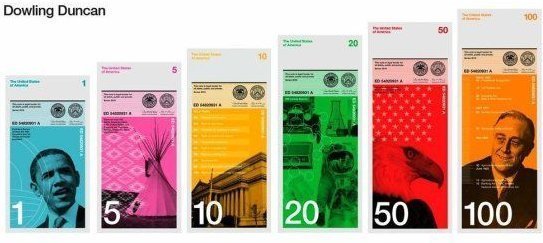
New Designs For The U.S. Dollar Bill ? Amazing New Designs For The Dollar BillThe American dollar is in bad need of a makeover. Thanks to the Dollar ReDe$ign Project, we may now have some options. Organized by creative strategy consultant Richard Smith, the Dollar ReDe$ign Project is soliciting ideas for the dollar bill of the future. "Our great 'rival', the Euro, looks so spanky in comparison it seems the only clear way to revive this global recession is to rebrand and redesign," the project notes on its website. Fisher started the project in with the intent of "trying to find a catalyst to restart our economy" he told Fox News. The recent competition is now closed, and voting ends on September 30. "This has touched people's hearts," Fisher said, and "people feel the dollar touches their lives." The leading vote-getter for this year's competition (pictured below) was submitted by British duo Dowling Duncan, which features a unique vertical design.
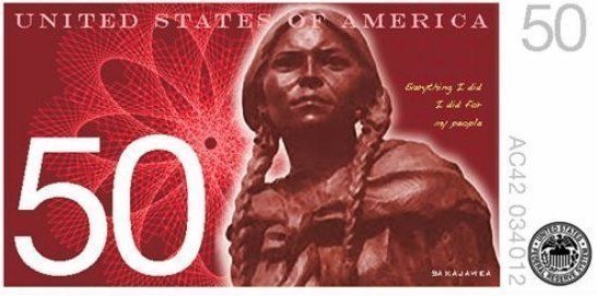
Why a vertical format? "When we researched how notes are used we realized people tend to handle and deal with money vertically rather than horizontally," they note on the Dollar ReDe$ign Project's website. "You tend to hold a wallet or purse vertically when searching for notes. The majority of people hand over notes vertically when making purchases. All machines accept notes vertically. Therefore a vertical note makes more sense." Mark Gartland submitted the entry below, entitled "America Today." The $50 bill features (pictured below) Sacagawea, the native American Indian who acted as Lewis and Clark's interepreter and guide. Noting the "cosmetic drabness" of the current dollar bill, Gartland selected various historical icons from including Benjamin Franklin, Abraham Lincoln and President Obama to represent the "diverse fabric" of the U.S.
Self-taught web designer Sean Flanagan submitted "Moving Forward, Looking Back," (below) which hews to many of "base color, size and orientation" of the classic dollar bill, but offers more than a few pleasant upgrades. Flanagan also utilized only American-designed typefaces and says his design would require at least "three different layers of solid ink," a preemptive strike against counterfeiting.
If these money makeovers weren't enough, The Dollar ReDe$ign Project has even circulated a petition to get the U.S. government to seriously consider their ideas. Which of these designs is your favorite? 
LOVE ♪♫♪♫ ♣¤═══¤۩۞۩ஜ۩ஜ۩۞۩¤═══¤♣ | |
- E-mail - orgNote -  Report post to moderator Report post to moderator |

not sure why America's so late on changing the bills. especially the sizes of each bill. that would be so beneficial for the visually impared.
LOVE ♪♫♪♫ ♣¤═══¤۩۞۩ஜ۩ஜ۩۞۩¤═══¤♣ | |
| - E-mail - orgNote - Report post to moderator |
we can't afford this shit right now
plus money will probably be obsolete in a few more decades as we switch to electronic transactions. | |
| - E-mail - orgNote - Report post to moderator |

Cool designs. But certain folk in the U.S. -- and, no, I ain't just broadly talking about "white folk" [Edited 9/19/10 17:00pm] Ὅσον ζῇς φαίνου
μηδὲν ὅλως σὺ λυποῦ πρὸς ὀλίγον ἐστὶ τὸ ζῆν τὸ τέλος ὁ χρόνος ἀπαιτεῖ.” | |
| - E-mail - orgNote - Report post to moderator |

| |
| - E-mail - orgNote - Report post to moderator |
I don't care if our money is more culturally diverse. In fact, I'd be all for it. Wouldn't bother me at all if there were no dead presidents on our money. But damn it! Our money is SUPPOSED to be GREEN! | |
| - E-mail - orgNote - Report post to moderator |

I don't think the vertical ones are the best, actually. I like the idea of varied denominational sizes and vertical design, based on the arguments given, but they do looking strangely unmonetary -- yep, like tickets or expensive candy bars or something. [Edited 9/19/10 17:52pm] Ὅσον ζῇς φαίνου
μηδὲν ὅλως σὺ λυποῦ πρὸς ὀλίγον ἐστὶ τὸ ζῆν τὸ τέλος ὁ χρόνος ἀπαιτεῖ.” | |
| - E-mail - orgNote - Report post to moderator |
I think they added color to ward off the counterfieting and money laundering!! But even with these new designs I cant see that its gonna stop that!!!! in fact its gonna make it a helluva lot easier to counterfiet!!! | |
| - E-mail - orgNote - Report post to moderator |
How much more would it cost to print these vs. the old bills? i would imagine for phasing out the old currency you would just turn in your old bills for new ones until there was a general cut-off date. | |
| - E-mail - orgNote - Report post to moderator |
The current design of the dollar is classic and something that has had its influence on so many movies, stories, ... it's just the dollar.
And how fucking stupid is the vertical-design argument? Yes, people usually do handle the money vertically, but with a vertical design you'll have a 50/50 chance of seeing the note "correctly", because either the one that gives the note or the one that takes will see it upside down.
A horizontal design is perfect, because it's way easier for a human brain to turn an image 90° than to turn it 180°.
Idiots... | |
| - E-mail - orgNote - Report post to moderator |
different sizes and colours needed definitely
Like our ones | |
| - E-mail - orgNote - Report post to moderator |
yuk! I don't like the vertical ones....probably just cause they are so drastically different...I mean pink and yellow? maybe I don't like change... but I like the way our money looks, as someone else said it's classic. our money already has many many anti counterfeiting features in it. it would be good for them to add something for the visually impaired though. "not a fan" | |
| - E-mail - orgNote - Report post to moderator |

Ὅσον ζῇς φαίνου
μηδὲν ὅλως σὺ λυποῦ πρὸς ὀλίγον ἐστὶ τὸ ζῆν τὸ τέλος ὁ χρόνος ἀπαιτεῖ.” | |
| - E-mail - orgNote - Report post to moderator |

|
these are, imo, hands down the best http://monomoda.com/2010/graphic-design-dollar-redesign-by-michael-tyznik/
-=-=-=-=-=-=-=-=-=-=-=-=-=-=-=-
Still it's nice to know, when our bodies wear out, we can get another -=-=-=-=-=-=-=-=-=-=-=-=-=-=-=- |
| - E-mail - orgNote - Report post to moderator |


I like the idea of quoting the constitution! "not a fan" | |
| - E-mail - orgNote - Report post to moderator |
It would, but then again, a bank note includes way more information (and also tiny bits) than a normal playing card and would look very crowded if you had to put everything on there twice and still make it look compact and stylish... | |
| - E-mail - orgNote - Report post to moderator |
| |
| - E-mail - orgNote - Report post to moderator |
They're green and I LOVE that they have brail on them, but they're still not good enough to change what we have already. | |
| - E-mail - orgNote - Report post to moderator |