 New topic
 Printable
| Author | Message |
Opinions Needed (Again) Some preliminary ideas I designed for a website promoting my photography as greeting cards...let me know if any of them catch your eye, fit well with my type of photography, etc, etc...I'll be directing some buyers to the website once it's up and running, so initial impact is what I'm interested in right now, I guess. I'll take care of navigation issues later.
Don't have a name for my "company" yet, so just used the names Wellbeyond and Dzinermachine (my hotmail email address) for now. Thanks...*smile* 1) 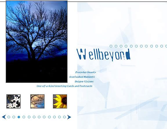
2) 
3) 
*By the way, this is the mug design the cancer center went with...it was the one you guys liked the least...lol  | |
- E-mail - orgNote -  Report post to moderator Report post to moderator |
then you HAVE to go with the pic that people like the least | |
| - E-mail - orgNote - Report post to moderator |
I liked the one they have chosen for the canacer prevention nr1 is my favorite | |
| - E-mail - orgNote - Report post to moderator |

#1 "Nobody makes me bleed my own blood...NOBODY!"
johnart says: "I'm THE shit" | |
| - E-mail - orgNote - Report post to moderator |

I like number three. it's a gorgeous photograph. | |
| - E-mail - orgNote - Report post to moderator |
#3 is my favorite as a design, though from what I've seen #1 would fit your type of photography better. | |
| - E-mail - orgNote - Report post to moderator |
JoeyMFinCoco said: #3 is my favorite as a design, though from what I've seen #1 would fit your type of photography better.
I think Byron tends to photograph nature more often as opposed to urban or city landscapes. I think you're right, number three is cool. | |
| - E-mail - orgNote - Report post to moderator |
JoeyMFinCoco said: #3 is my favorite as a design, though from what I've seen #1 would fit your type of photography better.
Co-sign....OMG...I can't believe I actually agree with him on something | |
| - E-mail - orgNote - Report post to moderator |

I like option #1.
And it's cool with the Wellbeyond on it because in a way it reads: Wellbeyond...everyday beauty Wellbeyond...overlooked moments Wellbeyond...unique visions Wellbeyond...one-of-a-kind greeting cards and post cards. Just tweak the pictures a bit. Open them up a little more. I'm firmly planted in denial | |
| - E-mail - orgNote - Report post to moderator |

| Moderator |
I like the photo in #3 the best...but I like #2 better over all. In spite of the cost of living, it's still popular. |
| - E-mail - orgNote - Report post to moderator |

i dont like any of them!
i like #3 the best, but from a greeting card stand point #2 | |
| - E-mail - orgNote - Report post to moderator |

| Moderator |
ella731 said: i dont like any of them!
i like #3 the best, but from a greeting card stand point #2 I like you ella In spite of the cost of living, it's still popular. |
| - E-mail - orgNote - Report post to moderator |
Sweeny79 said: ella731 said: i dont like any of them!
i like #3 the best, but from a greeting card stand point #2 I like you ella I like you too S-W-E-E-N-Y | |
| - E-mail - orgNote - Report post to moderator |
| Moderator |
ella731 said: Sweeny79 said: I like you ella I like you too S-W-E-E-N-Y In spite of the cost of living, it's still popular. |
| - E-mail - orgNote - Report post to moderator |
I like them all, but my order of preference for your objectives is:
2) 1) 3) | |
| - E-mail - orgNote - Report post to moderator |
Sweeny79 said: ella731 said: I like you too S-W-E-E-N-Y Dear Byron, I think you should name your company after me, since we are all aware all your ambition comes from me any way thanks | |
| - E-mail - orgNote - Report post to moderator |
I like number 2 and 3. On number 2 a little white border with a drop shadow of distance 2 and size 3 with the colour black would make it look like a picture postcard very instyle in website design just now.. | |
| - E-mail - orgNote - Report post to moderator |
katt said: I like number 2 and 3. On number 2 a little white border with a drop shadow of distance 2 and size 3 with the colour black would make it look like a picture postcard very instyle in website design just now..
Explain a little more, if you can... *smile* | |
| - E-mail - orgNote - Report post to moderator |
Nothinbutjoy said: I like option #1.
And it's cool with the Wellbeyond on it because in a way it reads: Wellbeyond...everyday beauty Wellbeyond...overlooked moments Wellbeyond...unique visions Wellbeyond...one-of-a-kind greeting cards and post cards. Just tweak the pictures a bit. Open them up a little more. Hadn't looked at it that way... | |
| - E-mail - orgNote - Report post to moderator |
a combination of 1 & 2 | |
| - E-mail - orgNote - Report post to moderator |

I like the first one!!!
| |
| - E-mail - orgNote - Report post to moderator |

Lizzy7701 said: I like the first one!!!
| |
| - E-mail - orgNote - Report post to moderator |
| - E-mail - orgNote - Report post to moderator |
Definitely leaning towards #1, although I love the look of #2.
#1 seems more user friendly all around (the layout seems easier to read), but that tree picture just sells it-gorgeous work, Byron. | |
| - E-mail - orgNote - Report post to moderator |
| - E-mail - orgNote - Report post to moderator |
number 1 | |
| - E-mail - orgNote - Report post to moderator |
so are there other options for the initial impact ? not that these arnt nice photos ...
but you said impact right ? i like the layout of #1 though i think a different background color then white unless you switch the main photo to the white flower pic i think the wellbeyond name is nice but i dont care for the font in the #1 | |
| - E-mail - orgNote - Report post to moderator |
Sweeny79 said: I like the photo in #3 the best...but I like #2 better over all.
I agree. | |
| - E-mail - orgNote - Report post to moderator |
#1 Is the most "to the point" design.
The least confusing to my eyes anyway. It's also the only one you don't have to turn your head to read. #2 Is the most artistic. #3 Is the most autistic. Not a slam, just trying to describe the way the company name looks. Very nice work. tA France countdown - T-Minus 1 day and counting.  Tribal Disorder Tribal Disorder
http://www.soundclick.com...rmusic.htm "Ya see, we're not interested in what you know...but what you are willing to learn. C'mon y'all." | |
| - E-mail - orgNote - Report post to moderator |

Mach said: so are there other options for the initial impact ? not that these arnt nice photos ...
but you said impact right ? i like the layout of #1 though i think a different background color then white unless you switch the main photo to the white flower pic i think the wellbeyond name is nice but i dont care for the font in the #1 Don't be | |
| - E-mail - orgNote - Report post to moderator |