| Author | Message |
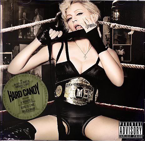
ORIGINAL COVER OF MADONNA'S HARD CANDY...when it was going 2 be called "Give it 2 me" PLUS SESSIONS OUTTAKES! 
 [Edited 6/15/08 9:24am] | |
- E-mail - orgNote -  Report post to moderator Report post to moderator |
- E-mail - orgNote -  Report post to moderator Report post to moderator |
more pics have leaked!
I will post them in a few seconds...some are truly stunning. | |
- E-mail - orgNote -  Report post to moderator Report post to moderator |
 | |
- E-mail - orgNote -  Report post to moderator Report post to moderator |
 [Edited 6/15/08 9:25am] | |
- E-mail - orgNote -  Report post to moderator Report post to moderator |
 | |
- E-mail - orgNote -  Report post to moderator Report post to moderator |
i don't like this cover shoot. You CANNOT use the name of God, or religion, to justify acts of violence, to hurt, to hate, to discriminate- Madonna
authentic power is service- Pope Francis | |
- E-mail - orgNote -  Report post to moderator Report post to moderator |
 | |
- E-mail - orgNote -  Report post to moderator Report post to moderator |
 | |
- E-mail - orgNote -  Report post to moderator Report post to moderator |
 | |
- E-mail - orgNote -  Report post to moderator Report post to moderator |
 | |
- E-mail - orgNote -  Report post to moderator Report post to moderator |
 | |
- E-mail - orgNote -  Report post to moderator Report post to moderator |
 | |
- E-mail - orgNote -  Report post to moderator Report post to moderator |
Why didn't she use these photos for the Special Edition? You know...to give us something new and "exclusive" for that set.The special edition contains the same photos as the regular release. | |
- E-mail - orgNote -  Report post to moderator Report post to moderator |
i like these pictures a lot better. i HATE the candy backdrop of the released cd. An individualist is a man who lives for his own sake and by his own mind; he neither sacrifices himself to others nor sacrifices others to himself... | |
- E-mail - orgNote -  Report post to moderator Report post to moderator |
 | |
- E-mail - orgNote -  Report post to moderator Report post to moderator |
 | |
- E-mail - orgNote -  Report post to moderator Report post to moderator |
ehuffnsd said: i don't like this cover shoot.
Me neither. I don't like the background. It's too busy. And the title Give it 2 Me is boring. Hard Candy is a much cooler title. | |
- E-mail - orgNote -  Report post to moderator Report post to moderator |
Glindathegood said: ehuffnsd said: i don't like this cover shoot.
Me neither. I don't like the background. It's too busy. And the title Give it 2 Me is boring. Hard Candy is a much cooler title. I know she's white but damn she's looking paler than the undead. Should have given her fangs and ran with the vampire theme "give it 2 me" (your blood). | |
- E-mail - orgNote -  Report post to moderator Report post to moderator |
actually, the fact that her face and body are so white and her boxing outfits were mostly black, it seems to go nice with the newspaper background, and the bit of color she has stands out.
but it looks REALLY WEIRD against the bright pink orange swirls. | |
- E-mail - orgNote -  Report post to moderator Report post to moderator |
Cinnie said: Glindathegood said: Me neither. I don't like the background. It's too busy. And the title Give it 2 Me is boring. Hard Candy is a much cooler title. I know she's white but damn she's looking paler than the undead. Should have given her fangs and ran with the vampire theme "give it 2 me" (your blood). i think it's the hair style that really bugs me about the whole thign. You CANNOT use the name of God, or religion, to justify acts of violence, to hurt, to hate, to discriminate- Madonna
authentic power is service- Pope Francis | |
- E-mail - orgNote -  Report post to moderator Report post to moderator |
Fans are already speculating that these photos will be used in the tourbook. | |
- E-mail - orgNote -  Report post to moderator Report post to moderator |
ehuffnsd said: Cinnie said: I know she's white but damn she's looking paler than the undead. Should have given her fangs and ran with the vampire theme "give it 2 me" (your blood). i think it's the hair style that really bugs me about the whole thign. How about her white lips? | |
- E-mail - orgNote -  Report post to moderator Report post to moderator |
I like this cover much better  [Edited 6/15/08 16:24pm] | |
- E-mail - orgNote -  Report post to moderator Report post to moderator |
funkycat00 said: I like this cover much better

This looks better! | |
- E-mail - orgNote -  Report post to moderator Report post to moderator |
funkycat00 said: I like this cover much better

[Edited 6/15/08 16:24pm] this is a bad ass cover. what in the world was she thinking with that nasty ass lollipop, homemade looking mess? An individualist is a man who lives for his own sake and by his own mind; he neither sacrifices himself to others nor sacrifices others to himself... | |
- E-mail - orgNote -  Report post to moderator Report post to moderator |
 
 
 | |
- E-mail - orgNote -  Report post to moderator Report post to moderator |
funkycat00 said: I like this cover much better

This is GREAT.It's amazing how,in many cases,the fans come up with better images than the ones that she chooses.There's a Madonna fan named Robster who always makes interesting cover artwork for her albums. | |
- E-mail - orgNote -  Report post to moderator Report post to moderator |
  | |
- E-mail - orgNote -  Report post to moderator Report post to moderator |
I think these pics are crappy. Her hair is stupid and she looks 10 years older than she is even. Bleh. | |
- E-mail - orgNote -  Report post to moderator Report post to moderator |
 New topic
 Printable