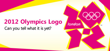
meow85 said: It's odd alright, but I'd still say it's better than the Vancouver Olympic logo:

I mean, seriously. An Inukshuk? A smiling Inukshuk? Like that has shit all to do with the westcoast. [Edited 6/4/07 14:32pm] I think this one is actually pretty cool. Ὅσον ζῇς φαίνου
μηδὲν ὅλως σὺ λυποῦ πρὸς ὀλίγον ἐστὶ τὸ ζῆν τὸ τέλος ὁ χρόνος ἀπαιτεῖ.” | |
- E-mail - orgNote -  Report post to moderator Report post to moderator |
CalhounSq said: looks like a blowjob in progress
Ὅσον ζῇς φαίνου
μηδὲν ὅλως σὺ λυποῦ πρὸς ὀλίγον ἐστὶ τὸ ζῆν τὸ τέλος ὁ χρόνος ἀπαιτεῖ.” | |
- E-mail - orgNote -  Report post to moderator Report post to moderator |
Genesia said: dreamfactory313 said: This one is hot, even though Chicago hasnt yet won the rights to hold the 2016 Olympics.
 The Chicago committee was told some weeks ago that they needed to redesign their logo -- because it looks too much like the torch (which is protected). Yeah, I heard about that. Its a shame too because I think they have the best one. | |
- E-mail - orgNote -  Report post to moderator Report post to moderator |
pardonme4livin said: papaaisaway said: Have you seen it? Is this the kinda crap kids are being taught in design school nowadays? It looks like a random piece of graffiti doodled by some truant ragamuffin kid in between vandalising a car and playing on the tracks. They should award the Games to Paris double quick! Some things are best left unveiled. Damn!  I see the "2012" but it looks like a rock'em sock'em robot.... It's actually P's new album title. M MyeternalgrattitudetoPhil&Val.Herman said "We want sweaty truckers at the truck stop! We want cigar puffing men that look like they wanna beat the living daylights out of us" Val"sporking is spooning with benefits" | |
- E-mail - orgNote -  Report post to moderator Report post to moderator |
dreamfactory313 said: Genesia said: The Chicago committee was told some weeks ago that they needed to redesign their logo -- because it looks too much like the torch (which is protected). Yeah, I heard about that. Its a shame too because I think they have the best one. Had the original looked more like the reflection of the skyline in the lake (which I suspect was the concept) and less like a torch, they would've been fine. Unfortunately, they'll probably have to start from scratch. Now that the "torch seed" has been planted in peoples' heads, that's all they'll see. It's too bad, really -- because the design is very cool. We don’t mourn artists because we knew them. We mourn them because they helped us know ourselves. | |
- E-mail - orgNote -  Report post to moderator Report post to moderator |
Lammastide said: meow85 said: It's odd alright, but I'd still say it's better than the Vancouver Olympic logo:

I mean, seriously. An Inukshuk? A smiling Inukshuk? Like that has shit all to do with the westcoast. [Edited 6/4/07 14:32pm] I think this one is actually pretty cool. This might sound weird but I think it looks like a strange, new, kind of burger. | |
- E-mail - orgNote -  Report post to moderator Report post to moderator |
onenitealone said: Lammastide said: I think this one is actually pretty cool. This might sound weird but I think it looks like a strange, new, kind of burger. Ὅσον ζῇς φαίνου
μηδὲν ὅλως σὺ λυποῦ πρὸς ὀλίγον ἐστὶ τὸ ζῆν τὸ τέλος ὁ χρόνος ἀπαιτεῖ.” | |
- E-mail - orgNote -  Report post to moderator Report post to moderator |
Lammastide said: onenitealone said: This might sound weird but I think it looks like a strange, new, kind of burger. With 5 curly fries at the bottom. Look! | |
- E-mail - orgNote -  Report post to moderator Report post to moderator |
onenitealone said: Lammastide said: With 5 curly fries at the bottom. Look! OK, now you've gone too far. Ὅσον ζῇς φαίνου
μηδὲν ὅλως σὺ λυποῦ πρὸς ὀλίγον ἐστὶ τὸ ζῆν τὸ τέλος ὁ χρόνος ἀπαιτεῖ.” | |
- E-mail - orgNote -  Report post to moderator Report post to moderator |
Lammastide said: onenitealone said: With 5 curly fries at the bottom. Look! OK, now you've gone too far. Too late. I was already ordering my next Happy Meal from Vancouver '10. | |
- E-mail - orgNote -  Report post to moderator Report post to moderator |
Lammastide said: meow85 said: It's odd alright, but I'd still say it's better than the Vancouver Olympic logo:

I mean, seriously. An Inukshuk? A smiling Inukshuk? Like that has shit all to do with the westcoast. [Edited 6/4/07 14:32pm] I think this one is actually pretty cool. I think it's stupid because it has absolutely nothing to do with Vancouver. If the Olympics were being held in Iqaluit, sure. But on the lower westcoast? Why not a raven? An orca? A mountain range? Something to do with the city? Or, if you absolutely must work the Native theme, why not something that -crazy as this might sound -actually has something to do with the Native groups who live in the area? A longhouse or bentwood box or something? Using an Inukshuk to represent Vancouver makes as much sense as using a cowboy to represent urban Toronto. "A Watcher scoffs at gravity!" | |
- E-mail - orgNote -  Report post to moderator Report post to moderator |
Whooooo boy, that's ugly.
Vancouver isn't ugly, but point taken about the weirdness of the choice of symbol. Chicago is nice. oh noes, prince is gonna soo me!!1! | |
- E-mail - orgNote -  Report post to moderator Report post to moderator |
 New topic
 Printable