 New topic
 Printable
It's too cutesy for my taste, but it's your body; your tattoo, so go ahead if you want it. "A Watcher scoffs at gravity!" | |
- E-mail - orgNote -  Report post to moderator Report post to moderator |

| Sr. Moderator
|
REDFEATHERS said: It looks shit IMO
Keep in mind that she said it was a rough draft. It's perfectly okay to sketch something out, take it to a tattoo artist, and ask him or her to flesh out the idea into a final design. I'm certainly no artist... the only reason I was able to "draw" my own master image was that it's a simple geometric design, and I could do it on my computer with Adobe Photoshop. Even then, I asked the artist for an idea about how to give it a little something extra (she added shading where the line bisects the circle). Please note: effective March 21, 2010, I've stepped down from my prince.org Moderator position. |
| - E-mail - orgNote - Report post to moderator |
 moderator
sweetserene said: This is a very rough draft...I think for one thing I would want the heart shapes to be wider and sit within each other better..
Honest criticism please. And what do you think of the small of the back as a location? 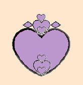
or 
old version 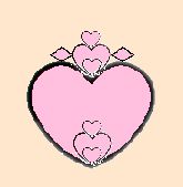
[Edited 1/26/05 16:17pm] I can't really find the difference between the first two. but they are better than the third one. Even though I link pink better, on the skin I think it'll be too light. Maybe a strong pink? | |
| - E-mail - orgNote - Report post to moderator |
gsh said: I'd suggest moving away from such a rounded shape for the hearts - especially the large one would work better more stylised and flaring out to the sides more (IMO). I think this will work better with the placement however it might take away from your "onion" reference, I'd also suggest either having the whole tattoo done as bold outline with no infill to ensure that the design doesn't get lost within the colour - that or have the artist add some depth/contour to the hearts with shading (but I like bold work, personally).
And there's no reason why pink would fade anymore than any other shade as long as you go to a reputable artist and always apply sunscreen when sunbathing. I've got white in my tattoos that is 18 years old and is no more faded than any other colour. Kudos for taking the time to design something meaningful. [Edited 1/26/05 17:31pm] Thanks for the advice and the kudos. I do want the general thing to be wider, as in 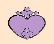
The hearts would be sitting within each other deeper than in this image. Flatter. So that basically many of the hearts wouldn't be so distinct... you would just see the humps and some of the sides...in other words the bottom of one heart would merge with the top of the one below it. And the diamond shapes would be smaller. These images don't have the lines as bold as I wanted them to be- a flaw from working with clipart in Paint [Edited 1/29/05 4:55am] | |
| - E-mail - orgNote - Report post to moderator |
matt said: sweetserene said: And what do you think of the small of the back as a location?
I think it's a nice spot. But it is very common, maybe even cliché. That's okay with me. Also consider: how visible do you want your tattoo to be? In that spot, it's going to be hidden most of the time, although it will be easy to show people your ink if and when you want to do so. Another placement idea would be to move the tattoo up so that the big heart is on your upper back, and the hearts and diamonds above it are on the back of your neck. This may or may not "work"... if you're interested, I'd suggest having someone sketch the design with a marker (seriously!) so you can get a sense of how it would look. If you do this, I'd recommend sizing the tattoo so that the width of the upper part is the same size as the more-or-less flat spot on your nape. I like that it would be a little bit secret... | |
| - E-mail - orgNote - Report post to moderator |
matt said: gsh said: that or have the artist add some depth/contour to the hearts with shading
Alternatively, multicolor hearts might look nice if they're done with colors that fade into each other. For this, you'd really want to look through artists' portfolios and find someone who's skilled at color work. Those are good ideas, thanks for suggesting them. matt said: Thank you [Edited 1/29/05 4:58am] | |
| - E-mail - orgNote - Report post to moderator |
Heavenly said: I can't really find the difference between the first two. but they are better than the third one. Even though I link pink better, on the skin I think it'll be too light. Maybe a strong pink? The first two were two slightly different colors (the second one slightly lighter than the first) but I think I accidentally uploaded them wrong. I've fallen out of love with the idea of this image being pink. I would eventually feel it was Barbie-ish and dislike that about it. That's why I started this thread. Not so anyone else could decide for me or anything like that, but so I could hear the negative points of it and decide for myself whether I would eventually feel the same way. So I could think about fixing certain flaws that I might come to dislike too before it was already tattooed on my body. Therefore I am very grateful for every contribution here, even the ones that were given in a somewhat harsh manner. | |
| - E-mail - orgNote - Report post to moderator |
sweetserene said: Heavenly said: I can't really find the difference between the first two. but they are better than the third one. Even though I link pink better, on the skin I think it'll be too light. Maybe a strong pink? The first two were two slightly different colors (the second one slightly lighter than the first) but I think I accidentally uploaded them wrong. I've fallen out of love with the idea of this image being pink. I would eventually feel it was Barbie-ish and dislike that about it. That's why I started this thread. Not so anyone else could decide for me or anything like that, but so I could hear the negative points of it and decide for myself whether I would eventually feel the same way. So I could think about fixing certain flaws that I might come to dislike too before it was already tattooed on my body. Therefore I am very grateful for every contribution here, even the ones that were given in a somewhat harsh manner. Only one question comes to mind. Why not shoose red? it's the obvious color when it comes to drawing a heart. | |
| - E-mail - orgNote - Report post to moderator |
I don't like red. | |
| - E-mail - orgNote - Report post to moderator |
sweetserene said: I don't like red.
| |
| - E-mail - orgNote - Report post to moderator |
REDFEATHERS said: sweetserene said: I don't like red.
There there.... | |
| - E-mail - orgNote - Report post to moderator |
Heavenly said: REDFEATHERS said: There there.... You forgot your spam.. | |
| - E-mail - orgNote - Report post to moderator |
Oooooops sorry Red | |
| - E-mail - orgNote - Report post to moderator |
I would avoid the black outline too.
You may even want to consider white ink for parts. It's very subtle. "You need people like me so you can point your fuckin' fingers and say, "That's the bad guy." "
Al Pacino- Scarface | |
| - E-mail - orgNote - Report post to moderator |

EvilWhiteMale said: I would avoid the black outline too.
You may even want to consider white ink for parts. It's very subtle. That's an interesting idea. BTW | |
| - E-mail - orgNote - Report post to moderator |
Having gotten 2 tattoo's myself, word to the wise.. Think about getting something different and something that means something to you. Not that i regret either of my tattoos, but i wish i would of gotten something different on my ankle... MY back tattoo i still love and would never change anything about it.
Just make sure you get somethign that means something to you.. and that you really like it.. Not something that when you walk down the streeet, someone has the same thing, or when your 55 you think to yourself, what the hell was I thinking????? Good Luck.. !!! The day came when the risk to remain tight in a bud was more painful than the risk it took to blossom - Anais Nin
"Unnecessary giggling"... | |
| - E-mail - orgNote - Report post to moderator |
